Sunday, January 31, 2021

Week 18

 I tried to set a theme of a teddy bears picnic for this still life so I could try and experiment with a narrative tone a bit more. This theme also gave me the chance to have more textures such as fur and pots .
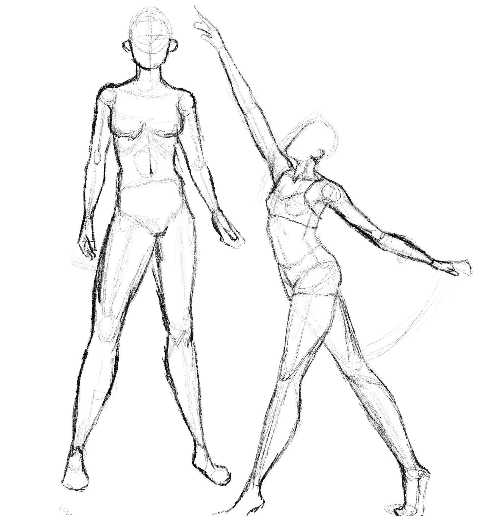

Sketches 


For these sketches I gave them quick washes of tone to show the lighting more.


In sketch one I had the size of the object spiral downwards to the biscuit in a box which also created a nice L shape overall shape. I also included more smaller objects that could be scattered around to make the scene look more natural. This is the option I carried forward to my final piece.


In sketch two I played around with perspective a bit more with a thinner set up that layers on top of each other and although I do like this idea it did make the overall shape a bit dull. So I put this idea to the side.


I did a photoshoot of my still life with different lighting to test out which one I liked the best which I have put in black and white so the tones can be seen clearer.


Final piece


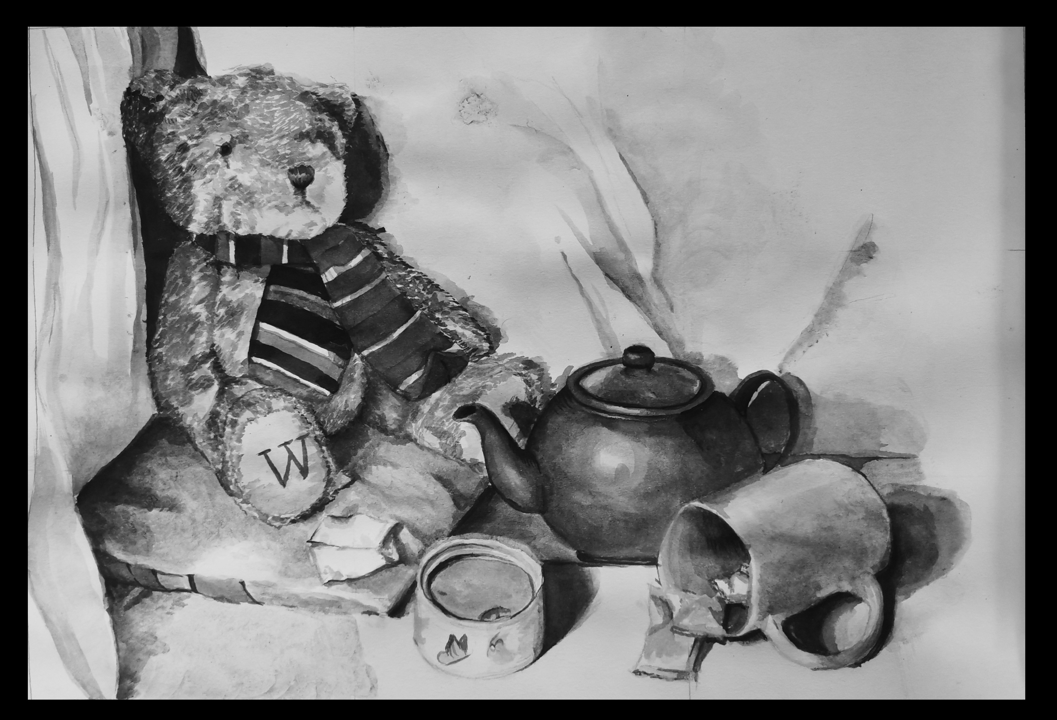
I decided to do my final piece in ink since I had the option to use a different medium in this task and I haven't used them in a while. I found inks easy to work with as they can be layered and this is good for building up texture which worked especially well in the fur of the teddy bear as the clumps of fur are shown using the brush strokes. One issue I did find was the paper I used isn't thick enough for the techniques I am used to for soaking off an ink blot so when I tried this lightly on the accidently ink spot in the centre it ate up the paper slightly. However I was restricted from preventing this issue as my thicker paper I normally use for ink painting I am unable to access . My favourite part of this piece is the pillow the bear is sitting on as I think the thickness and soft texture of the pillow came across well, the impression of material folding is present but I do think a bit more refinement may be beneficial. This is true for the drapery in the background as the section on the left has a good start at the shape of folds but a bit more contrast and use of harsher lines will give the folds a clearer structure overall. The drapery behind the teapot is my least favourite part of the entire piece since it was not blended well and didn't look as clean and developed as I would have wanted in the end, to resolve this i would pay more attention to the shape of the creases as these are what I was struggling to recreate since they are structured a but different to a fold. Overall I am very happy with the outcome of this task as I was able to further develop my skills with ink painting and I think I managed to show a good representation of texture within the scene.

Thursday, January 28, 2021

Future tribe style mood board {in progress but readable}

Style reference guide of the future tribes projects


for this project since I knew I was doing a female character I wanted to find an artist would draws the female anatomy nicely and also and artist that I personally like a lot for their style so I can learn from them throughout the project. I also looked at some artists who work with expressions and more exaggerated character looks, these artist/artists come from the animation sector and I know them from their work of more stylised films but the principles can be carried across into a more realistic version. Finally I included some painting style reference from different sources.


Minemikomail - anatomy 

I have followed this artist for a number of years and I have always liked they way she draws females since they have a sense of strength and the muscles can be seen but they are still feminine overall and it is balanced nicely, this is something I realy want to do with my character as I want her to be a strong and inspiring character but not manly and a tomboy and I think sometimes that hard to keep in balance.


Jin Kim - Facial expressions


Jin kim is one of the well know Disney animators and has worked on many of their best know titles such as Big hero six and Tangled, the reason I am looking at him for inpriation despite his simplified style is because of the expressions he does and how readable they are. to break down expressions into a simple style without it looking like a tom and jerry episode cut out can be hard but Kim does it really nicely and I think this must be because he studies people  a lot and knowledge of how the face move is key to being able to simplify it just like with human anatomy. like Jin Kim if expressions are needed then I will do the same as he does and use reference to do many and really practice and get to know the character I am drawing through their expressions.


Shiyoon Kim  - pose & silhouette


Kim is also works in the animation and recently worked on the film Into the spiderverse as a 2d character artist which is where I am going to be getting my reference from since I own the art book of the film, I have seen Kims work before and studied it previously for the style but this time I want to look at the way he poses characters and the flow within a pose. I find that he is very good at directing attention within a piece and storytelling which is something I'd like to do myself in my own work. Also when drawing I've noticed how he balances a silhouette of a character using a simple side and complicated side within the pose which makes the image clean and easier take in overall.


painting styles for inspiration to be added in due time


gladiator props


after completing the body model and adding the arm and leg wraps I moved onto making props and clothing for character. these items include a helmet, shoulder piece, leather arm guard, waist cloth, short sword and a shield.

all of these items bar the helmet and sword were modelled from a simple plane which after getting into the right shape I added a shell modifier to match the thickness I needed for each object. as for the helmet I actually copied part of the head of the character to get a nice rounded shape quickly and also so when scaled up it will fit over the head nicely.

which mostly of these they look very simple as I will be using the textures to add more dimension and finer details that would be costly to model in .

I think my least favourite part of all thee as the back of the helmet as it isn't shaped nicely and looks bland overall but I am hoping it will even out the painted detail on the front later on. My favourite part of the selection was the waist cloth as I tried to make it hang like a material would and it worked really nicely, also the over spill above the belt makes it seem more realistic as it wouldn't make sense of the top to be under the belt completely because the belt is holding the fabric up and if it was lower then it would be more likely to fall off whilst moving around a lot, an unfortunate accident if your were in the coliseum.

modelling the human form [images needed]

 reference images for male anatomy

when modelling I kept in  mind the way the muscles look on a human and how they would translate into a lower poly form. The key muscles I focused on was the deltiod muscle as it was key to creating a strong looking shape in the upper body area,
for the lower half I bulked up the thigh muscles which would make sense since a gladiator has to be faster on there feet, also  Spartacus who I am basing this model off was in the army for a period of time and back then this would mean a lot of walking across large distances which would build up the quad muscles.

To make the body I started with a box and used the swift loop function to cop it up so I could round it out and make the rib cage. from the rib cage model I pulled out the rest of the body and refined it based on each part anatomy. the hardest part to do was definitely the hands as it required a lot of tweaking an refining to make them have the right overall shape, one thing in particular that I struggled with was placing and welding the fingers to the palm, I originally made a mistake that cause a lot of mess and I had to fix later down the line.

{model image}one thing I am very happy with is the overall anatomy and stance as I think I managed to get it realistic , the muscles I think were well place and shaped and the angles of the body made sure the character didn't look as if they were ready to fall over and they were not just straight as the human body sits naturally in a sort of 's' shape which I put my model in.

overall I am happy with the outcome of the body modelling as I think its fairly accurate to correct anatomy but there are a few things Id change such as maybe bulking him up even more and exaggerating his strength, also more definition around the collar bone area could make the model look even more developed 

Tuesday, January 26, 2021

Gladiator mid point reflection

 At this point in my project I have finished both my modeling and my unwrapping of the model and at this point I reflect on the things I am the most proud of and the thing I would improve or do differently in hindsight.


The main success so far is the head as I wanted to make it as realistic as possible whilst keeping the cost down, to do this I focused main features and made them as accurate as I could and did not fuss on smaller details such as smile lines and super precise face shaping which would cost more tris. The tip of the nose I'm especially happy with as I tried to bare in mind the facial anatomy and it paid off here the most.


In hindsight I should have been more careful with leaving open edges within the model as i had a few which luckily didn't interfere with the unwrap ann I was able to use most for my benefit , for example the one on the forehead gave me the idea to put a seam in the same place as its just before the hairline so that if there was and marks caused by seam issues it could be forehead lines that often develop.


Another improvement would be the shaping of the calf muscle as it ended up looking quite angular which is okay but not ideal. To solve this I would add another vertical swift loop on the back of the leg.


The current model is a bit less muscular than what I was going to do originally but through the use of texture painting I will add more definition to the model to exaggerate the shapes which will give the impression of slightly bigger muscles. The props and clothing were pretty straight forward and I based the object off of historical research I had done into the types of armor and weapons that a murmillo would have used and then modeled based on reference images. I do think I could have added a bit more detail into the helmet as it does look a bit bland but I am hoping to fix that with textures further down the line.


Sunday, January 24, 2021

Week 17- Natural history museum


 To figure out what I wanted to do in a larger format for my final piece I did many studies of various things in the exhibits and some images of some specimens not in the 360 view areas such as their new exhibit “the wonder of nature” which also features some things from the harry potter franchise. My two favourite studies were the skull in the centre of page 1 and the ‘ Darwin's finch’ on page two, I decided to try and draw the finch as part of the larger piece as it would be more of a challenge with the texture of the feathers .


Final piece


I was really happy with the overall drawing of the bird as it ended up being pretty accurate to the specimen. I think making the left side a bit darker could improve the contrast and make it look more full formed overall, also the use of line could be more heavily used in the tail to define the ends and layers of the feathers coming together more. My favourite and most successful part was the detail in the head, specifically around the eyes as I wanted to have a focus on this part, and adding the detailed markings of the bird clearly and having more contrast did this. The texturing of the smaller and more fluffy feathers was really well done in the head area too and the continuation of this in the lighter areas of the body would make the texture clearer and more believable to a viewer.


feedback edits


Saturday, January 23, 2021

week 16: composition

 To control the lighting in the scene more I used an enclosed shelf and turned the lights off as to eliminate other light that the one I set up, I used a torch that I could adjust to experiment with the lighting more.I also played around with the composition to see what works and what does not. 


Thumbnails


The main thing I changed with each composition was the layout of the smaller items and the levels within each scene, I did try and have the heights get lower in a circle path having the smallest object in front and centre. The contrast of the object sizes was also a constant I kept and I found worked best when I used the dice as they made the roller skate look larger and towering in comparison. the two strongest options were numbers 3 and 4 where the positioning of the dice and roller skate were parallel . The increased height of the roller skate in option 3 through the use of the second book which works nicely in the scene, the main issue with option 3 was the glass as it made the shape of the scene more clunky, this however was resolved in option 4 where I lay down the glass creating a nice flowing L shape in the composition. by merging the placement of the glass ( and the positioning of the dice) with the set up of the roller skate it would create a nice balance overall, this does mean the candle will be removed from the scene as it would block the shape of the glass to much and throw things off balance again.

The least successful thumbnail was option 5 as it looked to bare, this was one I changed everything as to have a different angle of the roller skate but I didn't balance out the size of the skate with anything making it to heavy on one third of the set up. This could be improved through adding something of a medium height just behind the first set of wheels and a short and wide object to fill some more of the negative space.


Final piece


for my final outcome I used the merging of the options 3 and 4 to make my final composition and I think the size variation worked well overall as it crreated a nice L shaped outline . The only improvement I would make would be too add more dice to make it seem as if the dice poured out of the glass. The tonal range in this piece is good and I perticually like the crosshatched shading on the roller skate, however I think the background should have been had darker to frame the objects properly as they are blending with the backing currently. I would also make the highlights on the glass sharper as they are blurry and this mades the glass seem less transparent and smudged, refining the edges of the glass with darker line work would also make the object look crisper and more realistic overall. As for the roller skates, more definition is needed on the top buckle in particular as its shape isn't clear immediately to a viewer, making the top section of the boot above the plastic darker would make it more true to the scene as it looks like its the same as the lower section currently which is incorrect.


Referencing image for final outcome


Lighting variation  images


Thursday, January 21, 2021

week 15: Shading techniques

 Hatching


the main challenge I faced with this technique was keeping them going in one direction as I found the I increased the angle of the line as i went further down the ball by accident which is defiantly something to learn from. I also think this piece could do with more rendering to show the creases and bumps on the ball as they are not clear on the current piece. 


Crosshatching


I am quite happy with this piece as although I did pick a fairly simple object, I managed to get the shape of it very clear. I am perticually happy with the shadow and light work I used on the edges to make them more obvious to the viewer . I do think I need to pay more attention to keeping lines straight as it does wobble a bit in the middle and this bothers me but is defiantly something to learn from and avoid next time. 


circles


I wanted to try a more complicated object for this one so I found a decorative pitcher vase and attempted that. I sketched out the basic shape by measuring the proportion against a pencil and I think i got the bulk of it down correctly but some issues did pop up such as making sure the base section was symmetrical, but any issues I ended up fixing whilst shading the piece in . One main improvement I would make would be to have have some more light dark contrast 


scribbling


for this technique I used a ball point pen as I wanted to experiment a bit with continuous line and I find it easier to do this in pen. I think this piece worked nicely as I managed to use the pen pressure to make light a dark lines and also used line spacing to vary tone. I think the lighting on this piece worked well as I had a very clear highlight on where I avoided putting any tone on at all and worked around with darker tones to provide contrast in the piece. I do think more tonal work on the larger cylinder of the cap would improve it as it is a bit bland in comparison to the area beside it .


blending


this was the least successful piece of the bunch, I found it hard to get small defined work without making it look blurry with is something I will defiantly have to improve along with more tonal variation as I dont think that my use of tonal shading here was my strongest and darker areas could help to give the pencil case more shape. I do like the representation of the folds and shadows on the material as I do think they  are accurate to real life, although underdeveloped.


Stippling

This was the most difficult to control the area left for highlights and it was tedious but I do like a shape can be clear without lines to outline it.

the main improvement I would make would be to further define the edges through small clusters of dots. adding shadow beneath the object may also help to ground it more add flesh out the image.

may favourite part of this piece is the jaggered end as I managed to show the texture of the end through variation os the distance between the dots.


Final piece

When sketching out the scene I roughed out a bounding box for each item based on their height and width, this gave me something to work within. This initial sketches main issue was the candle holder was too are away from the vase but this was fixed later in the process. Also the shape of the base of the holder was skewed so I fixed this using a symmetry line to check my ovals, I also did this for the vase as there was some warping.


I am quite happy with the final piece but that doesn't mean it doesn't have its flaws. One of these flaws it the lack f contrast in some areas such as the vase and cookies which with some darker shading could look more well structured, it could also help to set things further back in the scene. I do like the use of cross hatching in the vase as through layering it gradually I built up the tone , to add highlights back in afterwards I used a putty rubber which worked well as I could mould the rubber to be very small allowing for precise highlights. Another improvement would be to add more of the surroundings to flesh out the scene more, especially as the cloth underneath was very dark so would provide a stark contrast to the lighter areas in the scene.


Character design iterations


To give myself more options and to force me to play around with the character I did 50 silhouettes for the possible design of the character, I knew I wanted a female with a average build as it fit the narrative planning I have laid out previously. To produce multiple variations quickly I tried layering two option on top of each other as they would meld well because they are all black silhouettes. By adding the variations together it produced some nice ideas and shapes that I may have not put down myself as a idea.

To progress further I will pick 10 from this selection I think have interesting shapes and I will do rough sketches to flesh out the details of the designs a little more, however these sketches will still be fair simple as to get a rough idea and doing fully rendered images for this would be unpractical.


Friday, January 15, 2021

future tribes background building

 From projects I've worked on in the past I have always found it most useful to build up a rough story for the setting and character before looking at the design as things such as social influence within the story and personal traits will reflect on how a person presents themselves. 

World setting

Far in the future humanity has spread to very corner of the known solar system, colonising and terra forming the natural landscape like a virus. But their great venture was quickly crippled, no one could agree on terms between factions and soon debates turned into wars. Wars that left resources almost non-extent and no authority figure that anyone could bring themselves to respect. So nations split into factions and then into even smaller tribes that looked back on ancient history as how humanity should be. Left with the scraps of what was and surrounded by the bones of the dead they learnt to make do and re use what they could. Tribe leaders, although regal , the jewels with they don have a macabre secret. Tribes are not just group of people but more like extended family, very close knit and territorial.


character setting

gender - female

age- 22

brought up in space as part of the reliquias tribe, daughter of the captain of a repurposed war ship . we will be imaging her half way through her story, after her people were attack and the captain killed she had to learn quickly the ins and outs of being the new captain whilst in the midst of a new war between the space-born tribes. at this point in her journey she has become cold and unforgiving, learnt that she had to show no weakness in order to save the tribe . 

Thursday, January 14, 2021

Figure drawing

 After watching week 15s lesson I did some figure drawing using both the techniques that I already know such as the triangle structuring to rough limbs in and the proportion tips that were mentioned in lesson


Future tribes moodboard


I decided on doing  female character for this project as I wanted to have a portrayal of a strong female warrior or leader, like he likes of Boudicca . Baring this in mind I looked at different clothing from cultures that repurpose what they had . I focused mainly on people who have a connection to English history such as ancient britons and I also included some viking examples. One thing I found was common with the ancient britons was the use of tattooing was widespread, tattoos were often blue and had meanings unique to each tribe but unfortunately due to the lack of the literacy ability the meanings were not recorded by then or the romans who encountered them so I want to make my own versions.


Wednesday, January 13, 2021

dagger


 here I sketched out a rough shape of the dagger and then filled it in with a flat colour so I could make use of clipping masks to add the shading. 

Starting with the blade and other metal areas,  first I roughed in shading and then used a painterly textured blender which helped make the blades metal look more rough and realistic. After refining the shading I went back in with edge highlighting to exaggerate the sharper edges and this made the piece look more developed. 


Then moving on to the wooden handle,I did the same process here except I used a multiply layer to add a wood texture which, along with the dark wood gradient map I used to add colour, made it look very realistic and is the part I am the most happy with overall. the final touches were the red ribbon that hung from the handle which was just a simple red line with some maroon shading on which set it nicely in the image. I do think I could have worked more on the lighter areas of the blade by adding some scratches as it would make it look more worn.


revisions after feedback

here I added more of the blue light to the dagger and I also added the same back lighting as the doll to warm up the dagger so it matched the other items more in the inventory screen.


Gladiator project ideas and moodboard


for this project I decided I wanted to make a character based on a real gladiator that became famous from being a slave that lead a uprising against the Romans. although outside the accounts of the Third Servile War not much is know about Spartacus since he was just a slave, a gladiator used for mere entertainment. Once part of the roman army and then sold into slavery and trained at the gladiatorial school in Capua.


Spartacus escaped in 73 BC and along with an estimated 100,000 other slaves took refuge at Mount Vesuvius. leading the Gladiator war against the Romans who attempted multiple attacks against them which where all defeated through the use of what we now recognise as gorilla warfare. But once they reached Lucania , the rebel army was destroyed after the Roman administration looked at this rebellion as a serious threat and sent an army to take down this group of runaways. After which Spartacus was thought to have been killed in battle and most of his followers hunted down. But even to today the name of Spartacus represents rebellion against those who would take away the freedom and rights of others.


He was a heavyweight gladiator known as a  murmillo. These were given a large oblong shield (scutum), and used a sword with a broad, straight blade (gladius), which was around 18 inches long.

They also had helmet adorned with the red main in a mohawk like shape which was an iconic part of many roman armour sets.

The material limits is something that needs to be considered for an accurate model, many materials we have now were not available at the time.  Despite popular belief, Romans did have a steel, high quality iron used for weaponry and armour could qualify as low carbon steel . cloth and animal furs were also in use widely .

this must all be taken into account when making the character if I want it to be accurate historically, which I generally prefer to go for.


Topology practice

 for this task I was asked to redo the topology of the human head, the key points of head topology is the sections around the eye, mouth and nose which are separate into different sections as illustrated below.

Around the eyes we have a circle section which is then surrounded by a mask shape, forming the brow bone. This together forms what I now refere to as the superhero mask. 

The nose and mouth is inclosed by the muzzle ring(light blue) this sits were the smile line would be. Inside is the area for the chewing and mouth muscles (red) and the tip of the nose.This technique may have a few slight variations but is overall consistent  throughout character modelling as seen 


My work
For my first attempt at face topology I think this went pretty well. I do think the segments could have been more evently proportioned as the sections on the top of the head are a bit uneven. I would also try and work on the ears more as the are a bit simple currently. I do like the work around the main areas as I managed to get the segments around these areas pretty even and well placed overall.


Modifying the mesh


Since Spartacus is Thracian, these were Indo-European people who inhabited large parts of Eastern and Southeastern Europe, so based on this I changed the model to look like a strong  eastern European. the main things I changed was the nose and the brow bone, I made these areas more pronounced as to create a more masculine shape.to the nose I added more definition to the tip of the nose and also added a bump as many of the references I looked at had this in common for people from eastern Europe I also made the neck thicker with a slight bump for the Adams apple.

I do think the ears could have used some more work as I think they are a bit clunky but this could also be resolved through texture sheets by adding the inner ear detail through textures rather than modelling which may make the model more expensive. This same concept of relying more on the painting than the modelling was carried throughout the process, meaning I mapped out only the essentials such as the key features and face shape, having them at a higher quality would be a better use of my budget than chunky low poly details that are hard to make out. It also gave me the freedom to play around with the details later, if I wanted a scar then I can paint one and try it and if it doesn't work then its not hours worth of remodelling to do.