Hatching
the main challenge I faced with this technique was keeping them going in one direction as I found the I increased the angle of the line as i went further down the ball by accident which is defiantly something to learn from. I also think this piece could do with more rendering to show the creases and bumps on the ball as they are not clear on the current piece.
Crosshatching
I am quite happy with this piece as although I did pick a fairly simple object, I managed to get the shape of it very clear. I am perticually happy with the shadow and light work I used on the edges to make them more obvious to the viewer . I do think I need to pay more attention to keeping lines straight as it does wobble a bit in the middle and this bothers me but is defiantly something to learn from and avoid next time.
circles
I wanted to try a more complicated object for this one so I found a decorative pitcher vase and attempted that. I sketched out the basic shape by measuring the proportion against a pencil and I think i got the bulk of it down correctly but some issues did pop up such as making sure the base section was symmetrical, but any issues I ended up fixing whilst shading the piece in . One main improvement I would make would be to have have some more light dark contrast
scribbling
for this technique I used a ball point pen as I wanted to experiment a bit with continuous line and I find it easier to do this in pen. I think this piece worked nicely as I managed to use the pen pressure to make light a dark lines and also used line spacing to vary tone. I think the lighting on this piece worked well as I had a very clear highlight on where I avoided putting any tone on at all and worked around with darker tones to provide contrast in the piece. I do think more tonal work on the larger cylinder of the cap would improve it as it is a bit bland in comparison to the area beside it .
blending
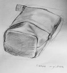
this was the least successful piece of the bunch, I found it hard to get small defined work without making it look blurry with is something I will defiantly have to improve along with more tonal variation as I dont think that my use of tonal shading here was my strongest and darker areas could help to give the pencil case more shape. I do like the representation of the folds and shadows on the material as I do think they are accurate to real life, although underdeveloped.
Stippling
This was the most difficult to control the area left for highlights and it was tedious but I do like a shape can be clear without lines to outline it.the main improvement I would make would be to further define the edges through small clusters of dots. adding shadow beneath the object may also help to ground it more add flesh out the image.
may favourite part of this piece is the jaggered end as I managed to show the texture of the end through variation os the distance between the dots.
Final piece
When sketching out the scene I roughed out a bounding box for each item based on their height and width, this gave me something to work within. This initial sketches main issue was the candle holder was too are away from the vase but this was fixed later in the process. Also the shape of the base of the holder was skewed so I fixed this using a symmetry line to check my ovals, I also did this for the vase as there was some warping.
I am quite happy with the final piece but that doesn't mean it doesn't have its flaws. One of these flaws it the lack f contrast in some areas such as the vase and cookies which with some darker shading could look more well structured, it could also help to set things further back in the scene. I do like the use of cross hatching in the vase as through layering it gradually I built up the tone , to add highlights back in afterwards I used a putty rubber which worked well as I could mould the rubber to be very small allowing for precise highlights. Another improvement would be to add more of the surroundings to flesh out the scene more, especially as the cloth underneath was very dark so would provide a stark contrast to the lighter areas in the scene.


No comments:
Post a Comment