Showing posts with label Tradtional art. Show all posts

Tuesday, April 27, 2021

Looking back at my journey to today

 A year in review


Since the year has come to the end i would like to briefly talk about how i have improved and what i want to improve on going forward with my tradtional work.

At the beginning of the year looking back I was unsure of my use of one and struggled with lighting and how it effected each indiviual object. However now I feel that I have a much more solid understanding on how to portray light in a scene and how it can creat bounce light and its not just the surface directly facing the light source effected.


Another improvement was in my composition, I had a vague idea of composition rules at the beginning of the year but I did find that my awareness for the compostion of the scene I was setting up improved with each piece. 


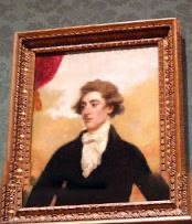
A personal achievement for me was getting comfortable using colour as I used to hate using colour tradtionally since it always seemed to go wrong easliy in the past, my own work had only explored gouche and watercolour and I was still unsure with those mediums. The first task I used colour was for the National portrait gallery task which I used colour pecil for. I really wanted to jump in the deep end here and after I completed this task ,which I found to turn out succesfully , I decided that if colour was an option in the task brief I would use it. I wanted to get confortable using it since I was already used to tonal work and the best way to learn is to explore. Now I prefere using colour and I enjoy using it, espashally wet mediums as they feel very natural and are good for layering.


Going forward in my journey I would like to use more colour to make paintings for personal work, I would also like to explore new mediums such as oils which I have dabbled in but not fully tried. Learning new technqiues in mediums I already know is also an aim but perticullay techniques that are out off my comfort zone of gradually builing up layers of washes since it would force me to adapt and get comfortable.

Sunday, April 18, 2021

Week 29- transport

 Preparatory work


To  choose a final subject I did a series of small study sketches, since I am not confident in my ability to draw mechanical objects I know I needed to take my time and properly observe the shapes they broke down into and the foreshortening that occurs due to perspective. I started out using the vehicles in the tours provided and these turned out fairly well done, my favourite being the tram since i was able to recreate how the lighting worked when looking through the windows. But my best sketches were done from a photo reference of a car I chose to look at because I found the lighting in some areas of the tour made it hard to see certain things and also there weren't many cars from the late 1900s. I did two studies based on images of a ford cortina 2000e but I chose the front view sketch since I think the perspective is interesting and suits the style of the car. There were also quite a few reflections on the bonnet of the car which would challenge me more when it comes to the final piece.


Final piece


the prepatory sketch I did was very basic but I tried to keep it clean so I could use it in the final painting which would give it faint line art, it would also help keep things accurate since painting cars is much different than painting more organic forms such as trees and water.


I tried to avoid the paper rippling on this painting so i used a piece of wood as backing and smoothed it on whilst slightly damp before I started painting. this did have a slight hiccup however as the dye on the box I use to weigh down the top edge bled onto the paper so I cropped the framing to make it a wideshot rather than a square frame like it was originally.


this painting was done by building up large washes of colour and then building upon the base colour to add shape and tone. this is most clearly seen in the bumper area of the car which is a huge contrast to the bonnet even though they started out the same colour. I left the highlights till later where I added them back in using white gouache that is thicker so could cover the colour and doesn't pick up the colour underneath.


I overplayed orange hues in some areas and around the edges of some highlights since some of the reflections were of warm lights and the matching this with orange accents on the shines worked really nicely. one area that I struggled with and I think ended up being the weakest part was the headlights since I was having problem with getting the reflections right and the panelling inside which I think I could have improved if I used thicker strokes to build up the reflections in the lights and then lines the panelling with a finer brush later, also adding stronger highlights here would also help since it doesn't look as reflective in comparison to the rest of the car and it should be around the same. one thing that I think worked well was the layers of depth and insetting of the grill at the front since I managed to get the curved edges down well whilst still showing that harsh contrast that defined the shapes. Another thing I would improve is the lines in the grill at the front as I struggled with getting them straight and i think if I were to redo it I would go back and use a smaller brush to make sure these lines stay straight, this also is the same for the two metal sections divine the grill into three sections as these are also slightly uneven and taking more time with it and having a steadier hand would be good if I were to re do this.


Reference:


Sunday, March 21, 2021

Week 23

 Landscape hunting


To choose what to draw I went on a walk to look for nice landscapes in my area, i wasnt able to do the piece onsite as it would get very busy in that area later on . I wanted to try a natural setting since I need to work on my foliage painting and drawing and this is a good chance to do that. I also wanted to have some animals in the scene such as ducks and birds.


Sketching 

  I sketched out a few of the images to further cement which one I wanted to use ,  after choosing which one I wanted I sketched it out onto a A3 page, i had to make sure the sketch lines were light and easy to erase since i would be erasing the majority so they won't show through the colours. I think the base sketch was good but I should have put more attention on the layers of foliage at the back to get a better idea of how it was structured as I ended up struggling with this later on, also I think that the perspective of the path was a but off which made it look steeper than it achually was so next time I should look again at the angles within the scene to properly measure them in relation to whats around it. I think I managed to get the shape of the lake well represented through minimal detail in the sketch which meant I had a solid base to go on whilst painting .


Final piece


Since I was using watercolours my main focus was getting good areas of colour to build upon with details and highlights. For example for the lake I started out with washes of colour to match the algae brown colour of the lake, to find the main colour I found blurring your eyes takes away detail and leaves slodges of main colour. Then I went over top with a variety of colours and smaller brushes to make the ripples in the lake, I found it quite hard to get this right because it always seemed to balance between water and long grass but I tried to fix this using more rounded shapes at the end since ripples are radiating ovals rather than flicks, this is a mistake I made early on and next time I will try and pay closer attention to the shapes of textures and reflections. Another thing i think could have been improved is the colouring of the path right its more saturated than the path in the reference . One successful part of the piece was the painting of the orange bush in the back which has a nice depth throughout because of the harsh shadows that frame the shape of the bush.


Revisoon

Week 24

 Landscape hunting


I chose to go for the more gothic side of medieval architecture, there is a church in my local area from the mid 1500s which I chose to use as my subject


Sketching 

  Based on images from images that I had of the building and others from the internet I created thumbnail sketches to decide which one I liked best, each had their own charm but I chose the one highlighted since it had a nice balance of levels within the scene . I couldn't decide whether I wanted to do the piece in colour or in black materials, so to test I did very rough tests to decide which one I preferred. I found the tonal piece looked much more gothic and grimm than I wanted it to be so I decided that I'd do the piece in colour using a mix of watercolour and pencils .


Final piece


The final piece for this week is a fairytale like which I personally really like because it contrasts the personal association I have with churches like this which is this image of death and rules, whereas as here it feels new and light. I think my main improvement I would suggest for this piece is to refine details and have clearer lines and edges as I think it is missing an element of structure, for example the top of the main building has some small details that on the right are fairly well done but on the left are abstract and unclear, I could have gone in with pencil to fix this in hindsight which I must keep in mind for next time. Another thing Id fix is the larger shadow on the right side of the building, I struggled finding the right hue to use and I think building it up gradually to get the tone right would have been a better approach since it isn't working well here, it would also give more of a chance to build in more detail as the shadow is developed so the area looks less bland. One thing I think went well was the painting of the moss as I struggled at first to figure out how to apply it without making it look like climbing plants as moss looks a bit like chalk paint on a building at a distance. So I found taking a small amount on a dry brush and dabbing it on top of the base colours created this effect well, I also try to replicate the face the bricks effect breaks and shape of moss on the building which you can see most on the area closest to the viewer. Overall I am happy with the outcome but I think I need to practice more with refining my use of shadow all around in colour since I can find it challenging and it is seen here through both the refining and large shadow hue issues mentioned earlier.


Revision 1:


Sunday, March 7, 2021

National portrait gallery

 National portrait gallery observation


The pieces I liked the best from the virtual tour of the National Portrait gallery was the two pictured below, I unfortunately couldn't see the name of the pieces or the artist . The way the skin is painted, the pink hue makes them look flushed and healthy, it also has a good representation of the layers underneath.


Sketches


{needupdate}


I picked two references and did a colour study of each using pencils. My main aim was to try different ways of getting that depth in the skin and the tones. The first I layed down a base skin tone first and then went back out with the colours, the pecil i used for the base colour was slightly more way than the others so I did find that there was a limit to how much could be layered and blended overtop. The secon I layed down areas of colour around the face and added a small amount of light shading and then applied the skin colour overtop which also blended the colours already down into a smoother gradient due to the waxy pencil being used. I found that this worked better and was easier to work with as well so I used this in the final piece. I prefered the silhouette of the first subject however and I haven't done a side profile as of yet so I decided to use that subject reference.


Final piece. 


The main improvement I would make to this piece would be to work more into the colours and add more blues and purples in areas of shadow as its a bit unbalanced now. I would also look again at the colours on the lips and attempt to use cooler colours as it's more of a deep red than a pinkish red in the reference. One thing I think went well was the shaping around the nose as the cool tones give a good impression of shadow which is contrasted by the pink around the edges of the nose.


Overall I am happy with this piece and although I do find working in coloured pencil a challenge I found a way to use them that suited me well.

After feedback


Second revision 
Blue around orbit of chin


References used for portraits


Friday, February 19, 2021

Week 21


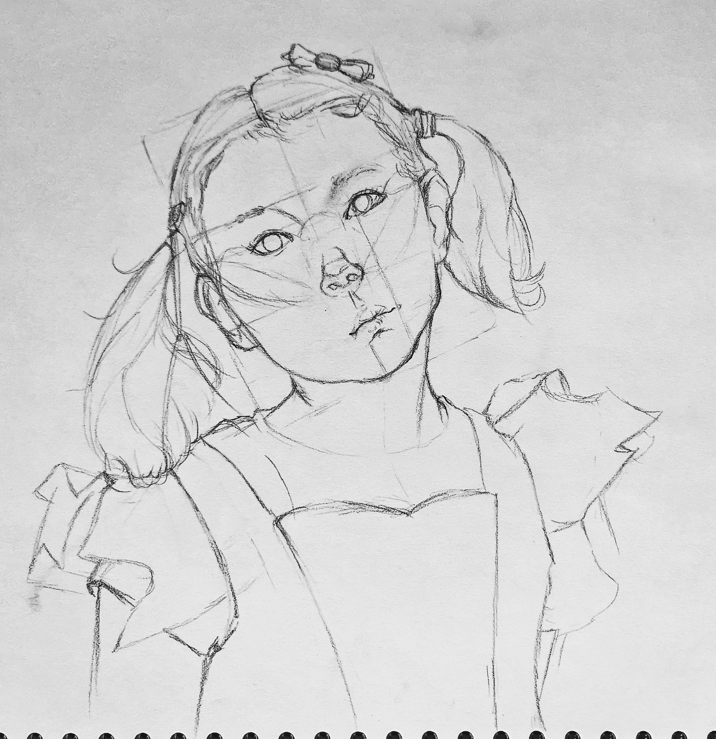
 For the planning sketches I tried out two different ways I know to structure a face, the first being the andrew loomis method of overlapping two squares to find the face proportions and the second being to draw a circle with some rough directional guidelines to build around. I found that the second sketch ended up looking stylised as the eyes were too large. The andrew loomis structure spaced out the face evenly and was easily adaptable to my own face shape.


This final piece turned out fairly well, although I do think the proportions of the face are stretched out which I would fix by re-evaluating if I were to redo this piece . I did adjust the eyes to round out the face a bit more. I do like the effect the hatching had with the shading , the consistency in the line direction pulls it all together nicely , but i do think the introduction of cross hatching in the darker areas might have been nice.

My favourite part of this piece is the structure of the nose as i have quite a rounded nose so i needed to show that without it looking bulbous, i did this by introducing shading gradually and softly to soften the shape.


Adding of hair detailed based on feedback 


subject reference (not drawing reference)
-I will be taking a better image soon , this is just for the time being


Week 20

I chose to do a portrait of a young person since it would make me have to adapt the basic face anatomy , this is because  children have slightly larger eyes in proportion to the rest of the face and the overall face shape is much softer 


 I think this piece turned out well, through the knowledge of human face anatomy I recreated an accurate depiction of my subject , although there are a few improvements I would make looking back. For example the mouth doesn't look tensed on the right side where the mouth is pulled upwards . To lay out the anatomy for the face I used methods from the artist Andrew Loomis, adjusting the roundness of the face slightly to fit more childlike proportions. I do think the forehead is a but to small compared to the reference but I do like the placement of baby hairs along the hairline as the irregularity makes it look more realistic. The use of cross hatching in the skin gave a softer look and also simulated the texture that peach fuzz gives to skin. Another thing I quite like about this piece is the way the eyebrows are drawn in as the subject has barely visible hairs that are sparse and I managed to portray that well through using only a few marks and allowing for them to give suggestion of there being hair there.


reference image


Sunday, February 7, 2021

Week 19- anatomy of folds

 Sketches


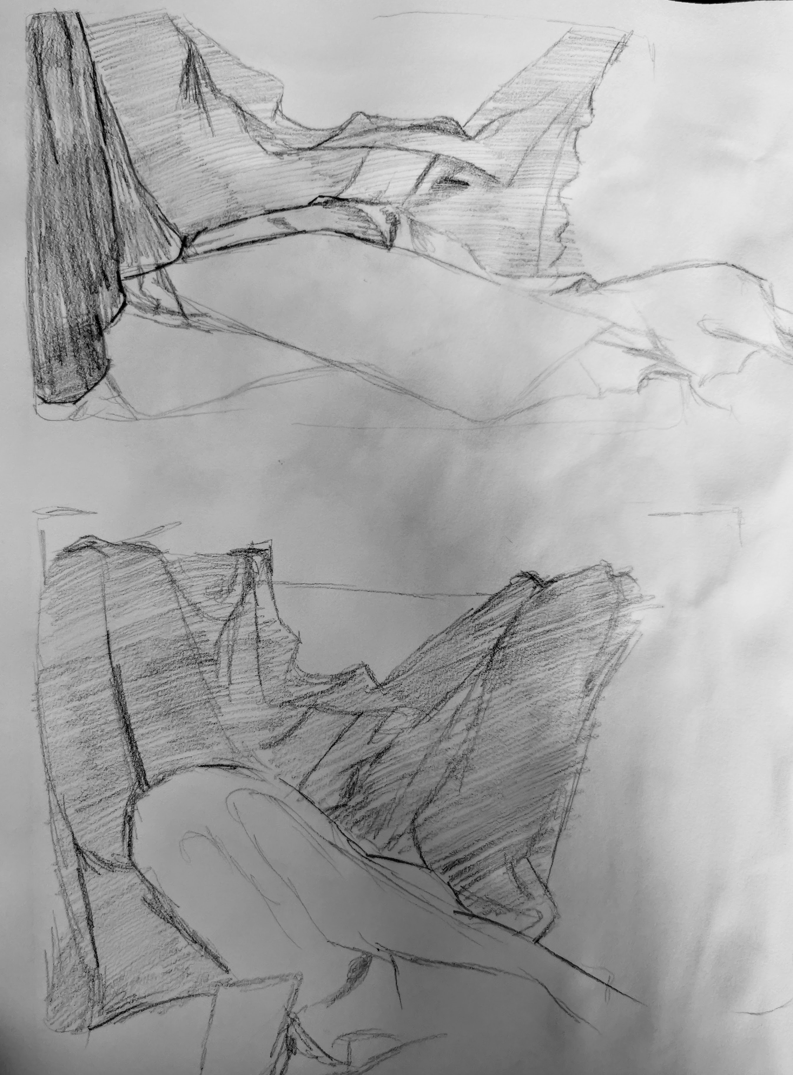
I kept the sketches rougher and focused on which one was more readable even without refinement which ended up being the second sketch which has less material variation allowing for more focus on the folds and shaping of material. The first sketch has more variation in tone but is harder to read as it didn't have a clear outline shape and it ended up looking more like a pile of washing than an intentional set up.


I also documented a few more variations through takeing pictures of the settings as seen below:


Reference image


Final piece.


This final piece ended up turning out pretty well but there are pros and cons . One thing that I think worked well was the shaping of the folds as I think I got them to look well shaped especially in the centre of the piece as the contrast pushed the depth more, giving it shape. I also was happy with the shape of the edge details of the blanket which turn into a fold, here I tried to alter the shape of the design of the edge to fit the flow of the fold and this was successful. 


One improvement I would make would be to have more contrast in the linework of the piece as outside on the centre it is all quite light and adding some heavier areas could help represent the weight of the drapery more. Contrast could also be pushed in the material covering the rounded object as it would bring it more further forward in the scene and set it more concretely as the focal point, which currently it is not .


Another thing I think went well is the use of edge highlighting to make a fold look sharper in certain areas such as the centre and areas with a cluster of smaller prominent folds. I also used to create inert folds upon a material by putting down areas of tone and removing it through dabbing the putty rubber on it.

after feedback


No 2


Sunday, January 31, 2021

Week 18

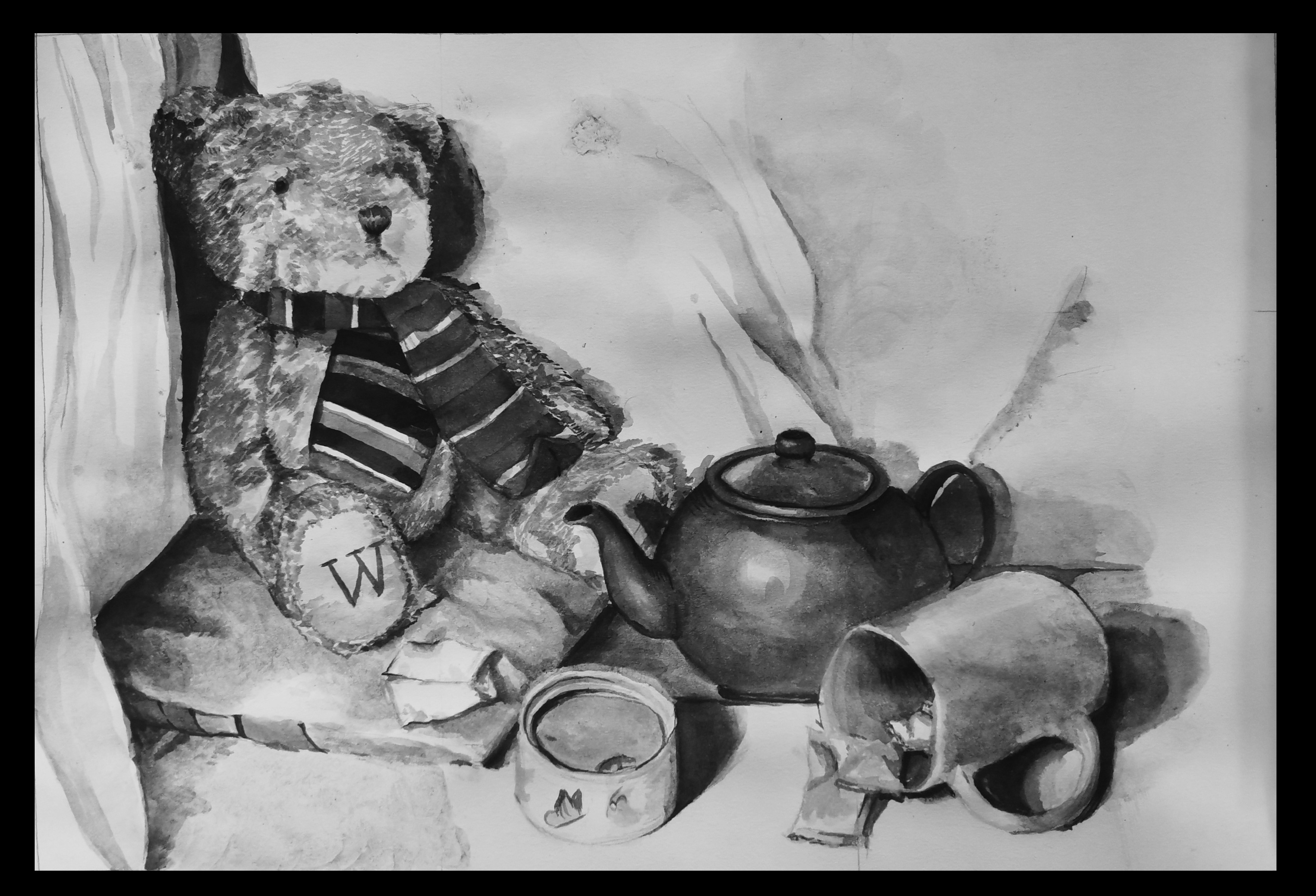
 I tried to set a theme of a teddy bears picnic for this still life so I could try and experiment with a narrative tone a bit more. This theme also gave me the chance to have more textures such as fur and pots .


Sketches 


For these sketches I gave them quick washes of tone to show the lighting more.


In sketch one I had the size of the object spiral downwards to the biscuit in a box which also created a nice L shape overall shape. I also included more smaller objects that could be scattered around to make the scene look more natural. This is the option I carried forward to my final piece.


In sketch two I played around with perspective a bit more with a thinner set up that layers on top of each other and although I do like this idea it did make the overall shape a bit dull. So I put this idea to the side.


I did a photoshoot of my still life with different lighting to test out which one I liked the best which I have put in black and white so the tones can be seen clearer.


Final piece


I decided to do my final piece in ink since I had the option to use a different medium in this task and I haven't used them in a while. I found inks easy to work with as they can be layered and this is good for building up texture which worked especially well in the fur of the teddy bear as the clumps of fur are shown using the brush strokes. One issue I did find was the paper I used isn't thick enough for the techniques I am used to for soaking off an ink blot so when I tried this lightly on the accidently ink spot in the centre it ate up the paper slightly. However I was restricted from preventing this issue as my thicker paper I normally use for ink painting I am unable to access . My favourite part of this piece is the pillow the bear is sitting on as I think the thickness and soft texture of the pillow came across well, the impression of material folding is present but I do think a bit more refinement may be beneficial. This is true for the drapery in the background as the section on the left has a good start at the shape of folds but a bit more contrast and use of harsher lines will give the folds a clearer structure overall. The drapery behind the teapot is my least favourite part of the entire piece since it was not blended well and didn't look as clean and developed as I would have wanted in the end, to resolve this i would pay more attention to the shape of the creases as these are what I was struggling to recreate since they are structured a but different to a fold. Overall I am very happy with the outcome of this task as I was able to further develop my skills with ink painting and I think I managed to show a good representation of texture within the scene.