Wednesday, April 28, 2021

materials Final evaluation

page 1


page 2


 For this project I set up a concept of the inventory of a vampire hunter in the victorian time, this meant i tired to keep thing period accurate .


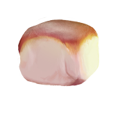
one thing I think went well was my use of texture brushes to build up effects throughout the project as it allowed me to experiment more with layering the effects they made to fine tune what I wanted much more efficiently, a good example of this is the flour on top of the bread roll which I used a mix of a cloud brush and a freckle effect brush to get a varying distribution of flour on the bread making it look more natural and non forced.

The main thing I wish I had done was look more into metals since its a weak point and it could have been more interesting to do more detailed metal items such as a locket or pocket watch, these would also add narrative which is what I really enjoy in projects is the world building aspect and telling stories through my work.


the biggest challenge for me was the blunderbuss gun since I am unsure of drawing both reflective metals and guns but I dont like shying away from something just because its unfamiliar to I pushed myself to look at different gun types and observe how the metal looked and try to recreate it, which I was very happy with the outcome. There is definitely improvements to be made such as making sure the perspective is right since I think mine ended up looking a bit off and also not being stingy with highlights in the metal and really show off the shine. but I think did well to observe the reference I saw and compile it into my own creation.


My favourite piece from this project was definatly the vamp away bullets since it was the most refined and well developed metal I painted during the project. The balance of shine and gritty-ness from the dirt made it really well rounded and suited well for the grim and rough setting of the story. in a close second was the eyeball based of personal triumph of recognising when its okay to start again even if it seems like a lot of work because it may just turn out much better. This eyeball was such a huge improvement from my first attempt and also showed my growth during the project since the original eyeball was painted near the start and the final eyeball was redone much later and the improvement in lighting and colour use is clear.

Overall I am very happy with this project and I think I both met the brief and grew as an artist through my journey with this project by challenging myself and pushing to try and do better whenever I could. the main improvement I would take from this project which branched across a few of the materials is learning to take more time to push and refine the smaller details such as sharper highlights or thickness of line, these help to make pieces look more developed and accomplished in the final result and I missed this in a few pieces such as the tooth were the highlights were a bit duller than they should have been. 

I have also learnt that you need to have someone checking your work regularly as its very easy to get used to what your drawing and miss mistakes that are stunting the progress of your work, and even if theres no one around I found taking a 10 minute break and then look at it again with references next to it to compare can really help with learning to spot hiccups here and there.

book and bag

 Book


this piece worked very well, I painted it tonally again and used gradient maps which meant I could play with colours a bit since I was unsure of what I wanted the cover to look like. The challenge of this piece was to get the texture on the cover right since it was a velvety texture which is really hard to emulate since its both matte and shiny. My painting managed to capture this to some extent and I was very happy with the fact I was able to get that softer feeling to the cover, to do this I used watercolour brushes which gave a softer effect overall and are quite fluffy so it built up that soft texture best. I do think that the sheen of velvet is missing somewhat and pushing the highlights further would defiantly help this . The book page were achieved pretty well and this was quite straight forward but one improvement I would make would be added some depth to the gaps between pages or page ripples that happen in older books, this would make the book look more well read and would make more sense since he would be referring to it for information regularly.


Bag


this was a simple bag to get started and was the first thing I made in this project, the bag is a waxed cloth bag which is a traditional way to waterproof bags.A modern example is many backpack are mad with waxed canvas material , for reference here is an example.

the wax produces an almost leathery texture this I tired to emulate this in my work by making the cloth texture softer and more skin like to match this leather like feel.
 I do think more refinement is needed in the depth of the material since it does look flat in areas and working into the areas more would push this further. 

I made sure to have a thicker visable seam. by blending the shadows out a bit it made the material look thicker. I think this worked really well but adding more pull to the material in some areas to give the bag some weight. For the same reason I would add more folds to the center which would show relaxation in areas.  

Overall I think this bag although simple was well done and consideration for the specific material I wanted was made.


bread

The bread was quite hard to do since the torn parts had a very hard to replicate texture but I was very happy with the way I was able to portray it. I started by painting this in using a rough painting brush and tried to not blend things using a smudge brush too much unless it was the smoother top area to get that fluffy texture. 


By building up the colours using an unblended rough brush it built up the torn texture along with it without having to paint these details in manually, I do think however this could have been pushed further by refining edges more to get crisper areas and to add more definition as it does all blend together a bit. The top of the bun was simple since it was smooth and non textured but I did want to add the white flour that bakers sometimes add so I used a cloud and a freckle brush to create this powered effect and this worked really well and this was one of the strongest parts of the piece. another strength of this pece was the use of very saturated colours around the top that makes the bread look fresh and bright which I think made it look much more appealing overall . The clear lighting worked really nicely in this piece and the stark contrast between the light side and the unlit side contrast really well and also gives the roll a more defined shape overall.

In the end I was very pleased with out this piece turned out since the texture of the roll is well developed and the use of lighting was very successful in giving the bread more volume .

some reference i used


Prosthetic leg


This prosthetic leg was based of others from the Victorian time period. The top part is a rusted metal which although isn't pretty is more fitting for someone who is on the move and maybe cant afford to replace it. The metal was painted by painting it plainly at first and then adding texture detail using rough metal brushes, creating a grainy texture which worked nicely.


I then added the rust which worked well but I think adding more orange on the edges would make it more realistic since rust fades out at the edges and turns a brighter copper colour and I missed this. Moving on to the foot, I tried to make it look like a painted wooden foot but the texture of the paint was clear and I think adding flakes and crash would have fixed this nicely, espheshally around the base of the foot which would be worn from walking. I do like the colours that went into creating the cream colour overall in the painting since it looks grungy and worm . 

I am overall happy with this piece and I think it was one of the more successful pieces in the project since it was well rendered and the detailing on the metal worked really well.


FINAL PIECE


reference used


Candle

  This candle was really interesting to do, the holder was quite similar to the metal on the blunderbuss gun except the light source was in the back of the object rather than above. The highlights were really nice to do here since they painted them to have orange edges which made them quite vibrant and eye-catching, it also matched the colour of the flame which would be adding the lighting affecting it.


The painting of the candle wax was interesting because when looking at reference the wax had a contrasting cool tone after the warm areas which provided some nice visual interests so I made sure to emulate this and I think it was a success.


The colour of the top of the candle wax is similar to that of the flame but that is because of how the light disperses through the material and the heat makes the wax more translucent and the colour is very vibrant. One improvement I would make to this piece would definitely be making the highlights in the metal sharper since as it is now it is a bit blurry which makes the material look softer and worn out whereas I wanted the metal to look fairly new since it's not an antique .

I'd also maybe blend the colours in the wax a bit more since they can look streaky in parts whereas wax is a softer material that wouldn’t create this effect.


reference used


smaller iteams

 tooth


since the inventory is vampire hunter themed I thought Id include a pointed tooth, this way a straight forward study since teeth don't have much texture the main thing I had to get right was the shine of the enamel but I did dull it slightly since its been in a bag so it wont be wet or well taken care of and therefor will have less shine. 

I painted this straight in colour, since it was straightforward and I also wanted to get used to painting on one layer as you do traditionally to get that more painterly effect on my work. 

I think this piece turned out pretty well but I do think it could have been interesting to make blood stains on it to make it clearer that it is a vampire tooth. 


reference 


flowers

These are wild dog roses and are said to protect against vampires in myth , I thought the centre was a bit more interesting than the more commonly pictured red rose which is just layers of the same petal over and over again. the most challenging thing was getting the texture of the leaves right since the leaves are strangely dull but still waxy in a way this I think I somewhat was able to emulate but could still use some work to refine.

 I was very happy with the way I was able to keep the petal more matte which contrasted the waxy leaves and made it look elegant. this also made them look much softer to the touch which I noticed in many flowers around my own garden.I think that the painting of the centre area was the most successful part as I like detail in the colouring since the centre is never just yellow and is rich will different colours which I thought was going to be hard to recreate without it looking busy. I used a impressionist method to do this since its quite a small area so it would still look realistic but was much easier to build up. The main improvement I would make to this piece as mentioned previously would be the highlights on the leaves since they arent as sharp as they should be 


references


Ring


this was the least successful of all the items since I couldn't get the shape right and the gold itself looked a bit too dull. I painted this tonally and used gradient maps but I think I could have been more interesting to paint it in colour right away to try and add more flecks of different tones and gold is made up a range of colours and is strange, this is hard to replicate using only gradient maps and working into this more would have been a big improvement. The engraving on the centre of the ring I liked but didn't wrap around  at the right angel so Id fix that if I were to redo it . I do like the edge highlights on the right side which helps to define the thickness since it looked a bit flat when I was first painting it and this was a big improvement. More of this could have been included on the left side were the edges look a bit flatter that intended and edge highlighting would fix this easily.

Another improvement id make would be more scuffing on the main part of the ring as if it were worn all the time as wedding rings are then it would be damaged by surfaces as someone works or goes about their daily life and such details would have helped to really tie together the piece and make it look as realistic as possible. 


references 


Matchbox


This was a simple experiment of painting a paper-like box, I started of in tonal and i focus on making sure the box had thickness by using harsher edge highlights which also better frames the shape of the box, I added gradient maps to get a creme box colour and added a red coloured pattern on the stride for the section that is used to light the matches, looking back I think it would be a good improvement to added more texture to this as its normally rough to activate the matches .

The matches themselves followed a similar process but I multiplied them to make the pack look full, this also meant i didn't put a whole lot of detail since it would be visible for the most part but I did like the harshness of the angle on the stick which refined the shape .


After receiving feedback I added a label to the top which I kept to only using red and white and making it look like a stamped label since it is fitting for the time period. I based the illustration on the label from old Victorian comic panels which I noticed was fairly realistic with subtle humour rather than the very exaggerated comics we have now. Overall I was very happy with the outcome of this piece but I think the label could have used more texture detail and the illustration could have had thicker line work to be clearer since its quite small on the box. I also think it could have been interesting to have one of the corners of the box be damaged a bit frayed to add more texture to the piece .

references uses

 old victorian cartoon from punch magazine


Eyeball

 I thought it be intresting to try and paint an eyeball since their surface has an intresting reflection and the veins at the back would be a challenge.


my first attempt I did looking at eyes rather than eyeballs and this lack of proper reference really showed in the product since the reflection was unclear and I could never get it to look finished . I also was unsure of how the veins would work and they ended up much too sparse compared to what a real human eyeball looks like


my second attempt I did a different approach of using images of full eye balls and 3D models that allowed me to see the full 360 and adjust lighting . I found that real eyes look kind of like yolk of a fried egg to put it bluntly, also the iris sits a bit further back in the eye which I didnt consider in my first piece. 


First I sketched out the basic shaped I needed first but rather than using tonal paintings and gradient maps I just went straight in with colour and an oil painting brush set which I found was the best set for replicating a waxy texture, the 'whites' of the eye I roughly painted since it didnt require any detail other than veins that I refined later . the main thing I wanted to focus on was the details in the iris since they are likesmall galaxies but I missed this in the first attempt. I think I managed to achieve and I am quite happy with the depth of colours in the eye and how they are blended together, the only thing I would change is to look again at the angle of the iris as I think it is slightly off .


overall I am very happy with this outcome and I am glad I tried again from scratch using proper reference,  if I were to redo it again or add more to it I would maybe include some of the flesh of the cornier since I do think it is a bit too clean as is . 

Tuesday, April 27, 2021

final evaluation

  Final piece


Three point piece _tonal and colour

 Tonal


as I always do when painting full pieces, I started out by blocking out tones to get a rough interpretation of depth and tonal value in the scene. The majority of time was in the painting of the trees since the patterns were unique and I knew I wanted some sort of glow effect around the throne so the intensity of light on each tree would decrease the further out it was to show the fall off of the light. this meant I couldn't copy and paste each tree to reduce time. I think I could have put more detail into this stage in areas such as the stone flooring and the edge lighing on the back wall.

Looking back at my journey to today

 A year in review


Since the year has come to the end i would like to briefly talk about how i have improved and what i want to improve on going forward with my tradtional work.

At the beginning of the year looking back I was unsure of my use of one and struggled with lighting and how it effected each indiviual object. However now I feel that I have a much more solid understanding on how to portray light in a scene and how it can creat bounce light and its not just the surface directly facing the light source effected.


Another improvement was in my composition, I had a vague idea of composition rules at the beginning of the year but I did find that my awareness for the compostion of the scene I was setting up improved with each piece. 


A personal achievement for me was getting comfortable using colour as I used to hate using colour tradtionally since it always seemed to go wrong easliy in the past, my own work had only explored gouche and watercolour and I was still unsure with those mediums. The first task I used colour was for the National portrait gallery task which I used colour pecil for. I really wanted to jump in the deep end here and after I completed this task ,which I found to turn out succesfully , I decided that if colour was an option in the task brief I would use it. I wanted to get confortable using it since I was already used to tonal work and the best way to learn is to explore. Now I prefere using colour and I enjoy using it, espashally wet mediums as they feel very natural and are good for layering.


Going forward in my journey I would like to use more colour to make paintings for personal work, I would also like to explore new mediums such as oils which I have dabbled in but not fully tried. Learning new technqiues in mediums I already know is also an aim but perticullay techniques that are out off my comfort zone of gradually builing up layers of washes since it would force me to adapt and get comfortable.

unreal set ups


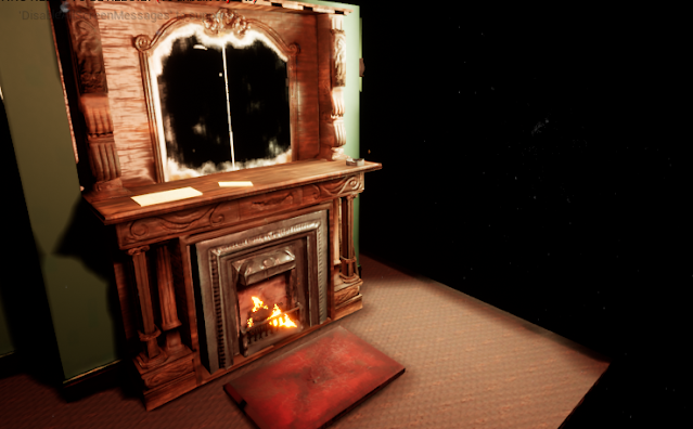
To create a controlled lighting environment i ditched all the start lighting and effects so i essentially had a void that wouldn't have an effect on the lighting. From here I added two lights, one to replicate the effect of a ceiling light, which i gave a warm hue and place it lower than the normal since it would have had to be lit by someone meaning it would hang lower. The other was natural light pouring in through a window which I let be less saturated since its daylight. The indoor lights were purposefully dimmer since natural flames produce much less light than the fluorescent bulbs we are used to

I also added a point light into the fire area to emulate the glow of the flames further which also gave a nice shadow from the grates in front of the firw. this really helped to add to the cosy feeling a warm flickering fire normally has and is perfect for what I am going for in this scene.


Zbrush sculpting


This was the first part I modelled and i did struggle with keeping it clean when modelling, I found using the orb curve created the cleanest lines and was smoother than the other brushes when engraving details. I smoothed any rough areas down with the standard smoothing brush whilst modelling so that the sculpt looked cleaner. I also used the hammered metal texture for the main part of it to get a more interesting texture .


this was the most time consuming area since I had issues with keeping the details looking clean, I managed to get it do a point were I was able to fix this to an extent but I think I will try and polish it more when texturing since substance painter allow you to add height to the texture through the use of normal maps.

The part I am most proud of is the side pieces as seen to the left . Here I tried to sculpt a angelic figure among roses, this was to give the piece a hint of religious influence since Christianity was very visually present in Victorian Britain. Traces of the imagery is in the statues that stand in cities that received a boom during this time . For example my own city, Liverpool has a large amount of Victorian buildings and statues since it was a major port so money was poured into the city. Religious influence is subtle but weaved throughout the city. So to make it fit the theme I chose for my project I wanted to have this subtle weaving of religion in my work. Another example of this is the use of roses throughout the design which represent Christ's passion and the blood of the martyrs. 

these two pieces were the main workload that I did in zbrush, other object didn't require as much, but other smaller part that had some modelling was the pillars either side of the iron


final evaluation


This project challenged me to work with a high to low poly workflow which was new, which I found I enjoyed much more since I was able to build upon a base without corrupting it making it a much less destructive workflow.

one good point was the detailing of the mantle piece, I originally used z brush to model this detail in but the clarity of the line was somewhat muddled in the result but it did provide a base to build upon in substance painter using a height brush. This clarity of line made the patterns much easier to l make out and look much higher quality. I think that in the future I would work more with the height brush in substance painter for these details over modelling them in since it is much quicker and gives a better result.

one thing I don't think worked as well was the dog bed that sits in front of the fire since the edges looked disjointed in the unreal engine, the painting of the texture here is also much messier than the rest of the scene so it stands out which although a muddy dog bed wont be perfectly blended and tidy it could be better melded together overall. Doing this would make it look more believable and would mean it didn't look as out of place in the final scene.

during my journey throughout my project I faced a few challenges I had to overcome , one of these was issues that came up during my baking process in substance painter that would effect both the normal and ambient occlusion which effected my ability to paint on the pieces. I found that painting this out manually was the easiest way to fix this and it also meant I had full control of the changes made and there was no chance of loosing details on other areas by messing with the bake settings, the best of both worlds in a way.

another success was the Sub UV fire effect as although it is a small part of the process it turned out really well and tied together the final scene and was crucial in the cosy atmosphere I wanted my scene to have. I also discovered ways to automate the process of splitting a video into its separate frames and laying them out evenly on a contact sheet which means the process was much more efficient than screen shooting a video frame by frame which waste a lot of precious time in a project pipeline


an improvement I would make to this project is the uv quality since some areas have slightly stretched UVs which lowers the overall quality, a good example of this was the front areas of the iron centre piece, here the quality of the uv is lower than the rest of the piece and it looks a bit more stretched than it should and if I were to reverse time to earlier in my project I would make sure to take more care and to review the UV s more carefully when unwrapping and check them for any disjointed areas.


the final thing I will talk about is how I was able to ensure consistency across the different textures when I split the model into smaller sections when painting to lighten the load on my pc. To do this I painted the base texture for one section such as pillars and then made the folder into my own smart material, this kept the colours and textures consistent across the model so that one piece wasn't less realistic than the other because of a change in painting style accidently. removing the human error in the process since it is easy to convince yourself they are the same and continue until someone points it out much later down the line and its a big fix .

In conclusion I think this piece turned out pretty well and although I defiantly have improvements I could make as I have already gone over previously but I also think that looking back I should have tried to be more ambitious and add more items to the scene to build up more of a narrative and challenge myself further. I think the most successful part was the main mantle piece since it grabs the attention of the player because of it grandiose which is what I wanted since this is a hero asset and I also am very happy in the detailing of this area in particular . I think the least successful part of the piece was defiantly the dog bed as it just wasn't of the same quality as the other pieces in the scene and had the most room for improvement overall.

Thursday, April 22, 2021

lighting and fire


I wanted to try an emulate the gas lighting of Victorian times, slightly dimmer and warm tones lighting. This would also make the fire look more cosy in comparison since although the tone is the same its a bright focal point which your naturally drawn towards.


fire effects


there were two methods available to make a fire effect which are the sub uv or just using one repeating image. I decided to try both so there was more variation in the scene , I also thought it would make it easier to reuse the particles for other things such as smoke and embers to make the fire more realistic.

Simple fire particle effect 


To make the basic texture for this I used a wet oils blender to smudge blotches of white to get a more natural billowing shape to the flame, this was then imported into unreal and made into a material which I could then use for a cascading particle system. I ended up reusing this one for different effects in the scene such as dust, smoke and embers. This meathod,even thought it worked well for the other effects didn't produce a very good fire effect since it didn't flicker in the same way as a normal fire so I think it should only be used for smaller details that are not focus point.

Sub UV 

This was my favourite method because it was just as easy as the first but produced a much better result. There were different ways i could have gone about making the flipbook for this effect such as using Houdini to curate a fire effect you liked and then exporting a flipbooks from that which i did experiment with using Houdini apprentice but my pc had issues so i couldn't fine tune it much past the standard fire effects but here is what i made in Houdini.


The easier method that i went back to using was to get a video of a fire on a neutral background and taking the frames to use as alpha frames .i found two ways to automate this process to make it quicker, the first was to load in the video directly to photoshop using the “video frames to layers” automation, after this reduced the number of frames too 16 and then exported the frames as jpegs so i could use the “contact sheet ii” function to properly lay them out quickly and more accurately than I could probably do. Then I adjusted the batch to be grayscale and adjusted levels to get the contrast I wanted.

From here I again went into unreal and used the flipbook to make a material with the node set up shown here:


Then plugged it into a particle system to get this result after adjusting the settings to be correct, this i think its a fairly realistic fire effect and I ended up using this for the main fire since it worked so well, with the addition of the extra details such as sparks and smoke it really tied the scene together nicely.