tooth

since the inventory is vampire hunter themed I thought Id include a pointed tooth, this way a straight forward study since teeth don't have much texture the main thing I had to get right was the shine of the enamel but I did dull it slightly since its been in a bag so it wont be wet or well taken care of and therefor will have less shine.
I painted this straight in colour, since it was straightforward and I also wanted to get used to painting on one layer as you do traditionally to get that more painterly effect on my work.
I think this piece turned out pretty well but I do think it could have been interesting to make blood stains on it to make it clearer that it is a vampire tooth.

reference

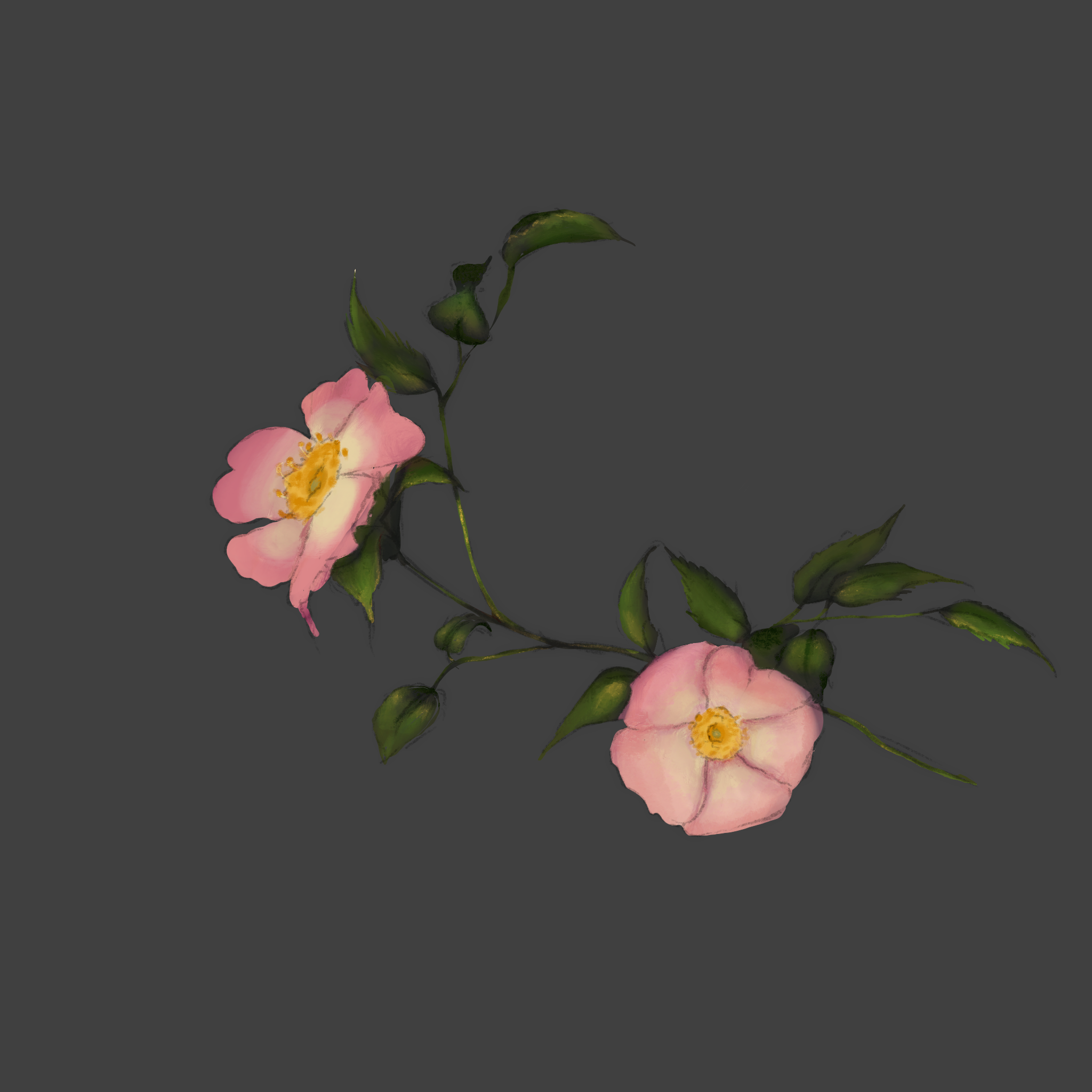
flowers
These are wild dog roses and are said to protect against vampires in myth , I thought the centre was a bit more interesting than the more commonly pictured red rose which is just layers of the same petal over and over again. the most challenging thing was getting the texture of the leaves right since the leaves are strangely dull but still waxy in a way this I think I somewhat was able to emulate but could still use some work to refine.
references


Ring

this was the least successful of all the items since I couldn't get the shape right and the gold itself looked a bit too dull. I painted this tonally and used gradient maps but I think I could have been more interesting to paint it in colour right away to try and add more flecks of different tones and gold is made up a range of colours and is strange, this is hard to replicate using only gradient maps and working into this more would have been a big improvement. The engraving on the centre of the ring I liked but didn't wrap around at the right angel so Id fix that if I were to redo it . I do like the edge highlights on the right side which helps to define the thickness since it looked a bit flat when I was first painting it and this was a big improvement. More of this could have been included on the left side were the edges look a bit flatter that intended and edge highlighting would fix this easily.
Another improvement id make would be more scuffing on the main part of the ring as if it were worn all the time as wedding rings are then it would be damaged by surfaces as someone works or goes about their daily life and such details would have helped to really tie together the piece and make it look as realistic as possible.

references

Matchbox

This was a simple experiment of painting a paper-like box, I started of in tonal and i focus on making sure the box had thickness by using harsher edge highlights which also better frames the shape of the box, I added gradient maps to get a creme box colour and added a red coloured pattern on the stride for the section that is used to light the matches, looking back I think it would be a good improvement to added more texture to this as its normally rough to activate the matches .
The matches themselves followed a similar process but I multiplied them to make the pack look full, this also meant i didn't put a whole lot of detail since it would be visible for the most part but I did like the harshness of the angle on the stick which refined the shape .
After receiving feedback I added a label to the top which I kept to only using red and white and making it look like a stamped label since it is fitting for the time period. I based the illustration on the label from old Victorian comic panels which I noticed was fairly realistic with subtle humour rather than the very exaggerated comics we have now. Overall I was very happy with the outcome of this piece but I think the label could have used more texture detail and the illustration could have had thicker line work to be clearer since its quite small on the box. I also think it could have been interesting to have one of the corners of the box be damaged a bit frayed to add more texture to the piece .


 old victorian cartoon from punch magazine

No comments:
Post a Comment