Wednesday, February 24, 2021

blocking out

To start out the modelling process I decided to gather my references and start build my model in 3ds max first using more simple shapes and leaving the ornate details for the sculpting in Zbrush. I decided here whilst modelling that I was going to limit the amount of props I have to very simple shapes as I wanted to save my budget for the detail in the mantle piece as I wanted to put some detailed carvings which would push up the tris more.


I roughed out the shapes by using mainly swift loop and extruding the shapes from one block for each main piece of the fireplace. I made the pillar details in the fireplace separate as I could repurposed them for the cast iron fencing in front of the fire pit area which keeps the shapes consistent and saves me a lot of time.

whats next?

From here I will move this into Zbrush to start sculpting on top of it to add all the smaller details and engravings. 

fireplace planning

 Ides

1-witches cottage hearth

2-dark Victorian fireplace

3-floo network fireplace


chosen idea

Out of the ideas I had I decided to go for the Victorian fireplace because I wanted to go for something darker and more gritty . I also want to try more ornate detail in the mantle area as some Victorian fireplaces have grand and ornate pieces which could be interesting to recreate. 


moodboard


Final piece and evaluation


Once I had done my final sketch up I decided to go ahead and do the final painting of the piece.

The process of which I documented and made into a speed paint video above. Both parts had the same process of starting with a tonal painting and then adding colour and lighting . I think that starting with tonal painting allows me to focus on getting the values right and not having to consider colour at the same time . It also means I can play around with the colours later to get it exactly how I want without backpedalling. I  overall happy with this piece as I think I managed to get the anatomy fairly accurate , although more work on the hands could push this further . I also like the lighting I achieved in these pieces as I think it gives the final outcome more depth and also adds to her feeling of regality as she is lit i a rich gold light and the shadow is a deep purple , both these colours have links to the perception of nobility so frame her character nicely.


Now the project comes to a close its time for me to look back and evaluate the process and product. Firstly I think I managed to meet the idea I had a the start of this project of a tribal leader and I also used narrative items to show story, status and personality. The use of skulls as decorative pieces I acted as nice eye catching pieces as well as having a deeper meaning that matches her story.


Looking at the anatomy the anatomy of the character I believe is accurate and the balance of muscles and fat on the body. I do think the hands need to be revised as they seem a bit off , using my own reference may help to get a more accurate result if I were to go back. I was most happy with the torso and chest as I had consideration of the shape of the rib cage and hips and how the fat sits on top. I also think the way the weight falls in the breasts works well as I bared in mind that unlike fat on the leg or stomach the fat here isn't direct attached to a bone so sits more like a water balloon. 


One improvement that could be made is the shape of the skirt as the material does not hang naturally on the shape of the body underneath, this could be improved using my own reference of material whilst painting, this would mean I wasn't basing it off general reference. I also think the material itself could do with some further rendering to make it look more like cloth since its quite smooth without .


Another thing that went well is the painting of the skull as it looks fairly realistic because of the attention to detail in the shading and rendering on the skull. I particularly like the detail in the eye socket which really made sure that it looked three dimensional and didn't fall flat. I painted it in black and white and then used gradient maps to add a gold colour which worked really well as it allowed me to mess around with the colours to get the right type of gold that would complement the hair colour as I had planned in the colour tests.


Overall I think the outcome was successful, the anatomy was executed fairy well and the design itself represented the story well whilst also being appealing. The asymmetry in the character makes them look more interesting and the use of rounded shapes tells the audience that she is kind . However this is nicely contrasted by the spikes in the head piece, boosting the image of regal strength which is important to the character backstory.


Gladiator evaluation

 At the beginning of this project I set out to create a semi-realistic murmillo gladiator, throughout the journey there has been things I think were very successful and others that I now look back and think I could have done better which I will dissect here.


Starting from the base I think the anatomy of the model turned out really nicely, I referenced muscle anatomy sheets whilst modelling to make sure I wasn't adding muscles that don't exist or making them look way too big in proportion to the rest of the body. I am most proud of the upper body as I think I made it nicely toned whilst also leaving wiggle room to define muscles further using the textures. I do think that the calf muscles could have done with an extra loop to smooth them out a little bit as I made them look angular overall.


Another thing I am proud of is the shaping of the face as I spent more time modeling the shape of the face than anything else as people are naturally inclined to look at faces, this meant if anything looked off here it could set the impression for the rest of the model. Since I was basing my character off Sparticus I looked at the few depictions of him that remain and interpreted the face shape based of this . the hardest part to get right was the shaping of the nose as the references I was following had a strong profile with a pronounced nose, bumping in the centre and a down pointed tip which I managed to get right in the end but I battled with balancing giving him a pronounced nose and giving him simply a big nose which wasn't the aim.


One improvement I would make to my final outcome would be the rigging and skinning as this was definitely my weakest part of the project as it was very new and frustrating for me, I think that the final model didn't move as naturally as I wanted it to and also I had clipping on items such as the shoulder guard and the skirt which I tired my best to fix but in the end I could only reduce. I think next time I need to pay more attention to the shaping of the object and how they would work in the rigging and skinning stage to save myself any frustration down the line.


Another improvement which is a small but crucial one is the painting of the area around the eyes as it looks unnatural and uncanny, this is important for the same reason as why the face is so important as the eyes look into other eyes. We are drawn to them as they are ‘ windows into the soul’ and what we look at when we talk to one another and therefore what we notice is wrong first. If I were to go back I would look into further references and try and paint them more accurately to get rid of the slightly uncanny valley felling they have currently.


Looking now at the items, the painting of the metal on the shield and other metal areas such as the helmet and shoulder guard worked very well. They all use the same painting as I painted a basic rough metal texture and then adapted it for each object by changing the colour slightly or dulling the shine to make it look dirty and well used. This metal texture provided a nice contrast the the rest of the textures on the model and other items which, bar the short sword, were all much softer and flowing.


Overall I think the project outcome is successful and the product matches the image I had at the beginning of the project . I think the things I found to be not as successful are definitely part of a learning journey for future projects going forward and indicate what I should have more consideration for in the future.


Presentation


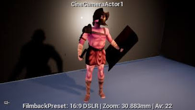
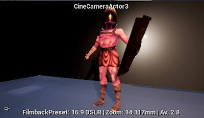
When presenting my work I wanted to have some interesting camera angles such as a worms eye view shot and I also kept in mind frame composition to make the shots look good . That said I do think more consideration for the rule of thirds should be made for the full body shots as some are a but too dead centre, changing the angle of the camera to have the weight of the subject favour one third of the image more than the other could make the composition more compelling .

For the shot of the face I used a close up with no angle to get a clear view of the face, when considering the composition of the shot I tried to balance the positive and negative space evenly which worked well in the final shot.


Monday, February 22, 2021

Rigging and skinning


As this was my first time rigging and skinning a character I do think it could be vastly improved but also I think I did well. The deformation on the shoulders and skirt area are the weakest , the skirt could be fixed by attaching it to the body so it would  move in an identical way to the legs , the shoulder could be fixed by adding another loop to prevent the folding issues I have come across . I made a short kick animation sequence to test of the deformation and to also challenge myself to 3d animation. The most successful part of the skinning was how the arm guard followed the movement of the arm nicey without deofring a lot, it is wasnt attached to the arm I was worried at first it would be all over the place and hard to skin to fit the stretch and bend of the arm however this was not the case and I think the link structure of the piece was a huge advantage in this since it allowed it to bend and deform smoothly without clipping or drastic stretching


one problem I encountered was that I realised at the end the bounding box was skewed and I needed to reset the xform , however if you do this with a skinning modifier active it ruins the mesh completely  which you can see the the image to the right. To fix this I extracted the skinning mesh, collapsed the skinning modifier, reset the X-form and then re applied the skinning mesh I had extracted previously. This kept the majority of my skinning, I did find some areas had some issues but these were not hard to fix and was much better than having to start from scratch.

Sunday, February 21, 2021

Lighting


https://pin.it/7EKluDt


In my presentation of my Gladiator I want to use a mix of different lighting for different shots. One effect I want to have is a heroic feeling which I think could be achieved through dramatic lighting, here I may use a split/ short set up as it has a high contrast effect, this set ups effect also reminds me of looking at actors on stage from backstage in theater and the boldness of that image of someone standing tall in the headlights. This boldness would complement the story of Sparticus well and also the strength of a gladiator.


For the shots that I want to showcase the face a little more I will aim for a simple lighting setup that will slightly accentuate the shape of the face, this will make it look a little stern and brooding . For this I think a rembrandt broad set up will work nicely since its softer but still has some contrast of lighter and dark areas. This I would also like to use for the full body shots for the same reason and also to have some consistency in the setup of the shoot.

Friday, February 19, 2021

Week 21


 For the planning sketches I tried out two different ways I know to structure a face, the first being the andrew loomis method of overlapping two squares to find the face proportions and the second being to draw a circle with some rough directional guidelines to build around. I found that the second sketch ended up looking stylised as the eyes were too large. The andrew loomis structure spaced out the face evenly and was easily adaptable to my own face shape.


This final piece turned out fairly well, although I do think the proportions of the face are stretched out which I would fix by re-evaluating if I were to redo this piece . I did adjust the eyes to round out the face a bit more. I do like the effect the hatching had with the shading , the consistency in the line direction pulls it all together nicely , but i do think the introduction of cross hatching in the darker areas might have been nice.

My favourite part of this piece is the structure of the nose as i have quite a rounded nose so i needed to show that without it looking bulbous, i did this by introducing shading gradually and softly to soften the shape.


Adding of hair detailed based on feedback 


subject reference (not drawing reference)
-I will be taking a better image soon , this is just for the time being


Week 20

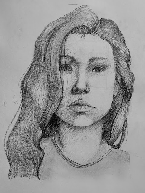
I chose to do a portrait of a young person since it would make me have to adapt the basic face anatomy , this is because  children have slightly larger eyes in proportion to the rest of the face and the overall face shape is much softer 


 I think this piece turned out well, through the knowledge of human face anatomy I recreated an accurate depiction of my subject , although there are a few improvements I would make looking back. For example the mouth doesn't look tensed on the right side where the mouth is pulled upwards . To lay out the anatomy for the face I used methods from the artist Andrew Loomis, adjusting the roundness of the face slightly to fit more childlike proportions. I do think the forehead is a but to small compared to the reference but I do like the placement of baby hairs along the hairline as the irregularity makes it look more realistic. The use of cross hatching in the skin gave a softer look and also simulated the texture that peach fuzz gives to skin. Another thing I quite like about this piece is the way the eyebrows are drawn in as the subject has barely visible hairs that are sparse and I managed to portray that well through using only a few marks and allowing for them to give suggestion of there being hair there.


reference image


Thursday, February 18, 2021

Texture sheets

 1


This sheet was for the skin and and the wraps on the feet and hands. The two best pieces on this sheet are the face and the abdomen as I managed to get them to look realistic ic. In the face I had to bare in mind the colour zones of the face which you can see clearest in the centre where it is flushed pink, here I exaggerated the saturation of the natural hue since a gladiator would presumably be outside most of the day and since it would be sweltering hot this would presumably leave its mark. This is also the reason I gave him a darker skin tone. The weakest part of this map is the bandage  textures are they are quite messy and also not as refined as I would have liked them to be, if I were to redo it I would have not separated them and only had one texture for both the hands and the same for the feet, this would have also made the seam painting quicker 


2


This sheet was for the objects not welded to the body. The most successful part of this sheet was most definitely the shield painting as I really like the shading on the red area and the way I painted the metal to be rough and unpolished, I did this to difference it from the clean and polished shields that soldiers used. The weakest part was the metal on the short sword as I think I could have given it more texture to make it look more worn and well used as he wouldnt have been given well polished and new lookingweaponry as that would be reserved for the army at the time.

UV unwraps

Uv unwraps


I split the uv sheets into two, one for the skin and bandages and another for the rest of the items. I had less on the skin and bandage sheet as I wanted to have more detail and also it would the items to have more of a boarder for seam painting. I think I packed them fairly well, especially the skin sheet, although I do think the sheet with the items would have been revised to reduce the empty space like the space in the centre as it could allow for more detail in the objects
I think I could have overlapped object that would have the same texturing more , for example the front and back of the short sword as it would have saved space and allowed things to take up more of the sheet giving them a higher resolution overall. I think the best packed areas was defiantly the shield as I used the metal border as a container for the rest of the shield and since it was all rectangular it was easy to puzzle together.

overall I think the Uv unwraps went very well but there are things I need to improve on based on mistakes I made here which I will make note of for my next unwrap.

Thursday, February 11, 2021

3/4 sketch up

 since I knew what my character would look like I moved on to drawing out the 3/4 sketches .  starting with sketching a basic female body, I didn't put detail into the face since the anatomy was the important part here. I had her build be fairly slim with some muscle definition .


from here I sketched overtop the design I have settled on with consideration for how the material would hang off the body. I had to change the look of the chest wehn sketching over as she is wearing a corset which would cause them the chest to be pushed up. I added the tattoos onto the character here too, the most important one being the one on the forehead which is a Celtic symbol called solomans knot which represents the union of man and the divine and it dates back to the stone age. 

I gave her a name at this stage as to make her feel more establsiehd in my own mind and also as it felt like a confirmation for the character design.


Further iterations & colour variations


after choosing my preferred design I tired to make more iterations of that design to explore my options further. the main thing I changed was the skirt as it was the main thing I was unsure of, I altered the length a few times and added smaller details and after consideration and the gathering of opinion from others I decided on the option at the very start. i think has more  asymmetry and the opportunity for a few more textures within the outfit, the train like back and a short front on the skirt makes the character look taller and also more individualistic as the plain long skirt was quite common which is a bit boring. I will however maybe hake the head piece even more dramatic by extending the spikes further which will push an almost saint like image which would fit the authority figure this character should be.

using the tonal colours I applied colours and produced even more variations that focus on the colour palette of the character.


( unsure of colour pallet so far, post to be finished)

Sunday, February 7, 2021

Week 19- anatomy of folds

 Sketches


I kept the sketches rougher and focused on which one was more readable even without refinement which ended up being the second sketch which has less material variation allowing for more focus on the folds and shaping of material. The first sketch has more variation in tone but is harder to read as it didn't have a clear outline shape and it ended up looking more like a pile of washing than an intentional set up.


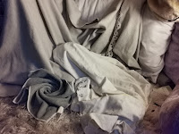
I also documented a few more variations through takeing pictures of the settings as seen below:


Reference image


Final piece.


This final piece ended up turning out pretty well but there are pros and cons . One thing that I think worked well was the shaping of the folds as I think I got them to look well shaped especially in the centre of the piece as the contrast pushed the depth more, giving it shape. I also was happy with the shape of the edge details of the blanket which turn into a fold, here I tried to alter the shape of the design of the edge to fit the flow of the fold and this was successful. 


One improvement I would make would be to have more contrast in the linework of the piece as outside on the centre it is all quite light and adding some heavier areas could help represent the weight of the drapery more. Contrast could also be pushed in the material covering the rounded object as it would bring it more further forward in the scene and set it more concretely as the focal point, which currently it is not .


Another thing I think went well is the use of edge highlighting to make a fold look sharper in certain areas such as the centre and areas with a cluster of smaller prominent folds. I also used to create inert folds upon a material by putting down areas of tone and removing it through dabbing the putty rubber on it.

after feedback


No 2