Sketches
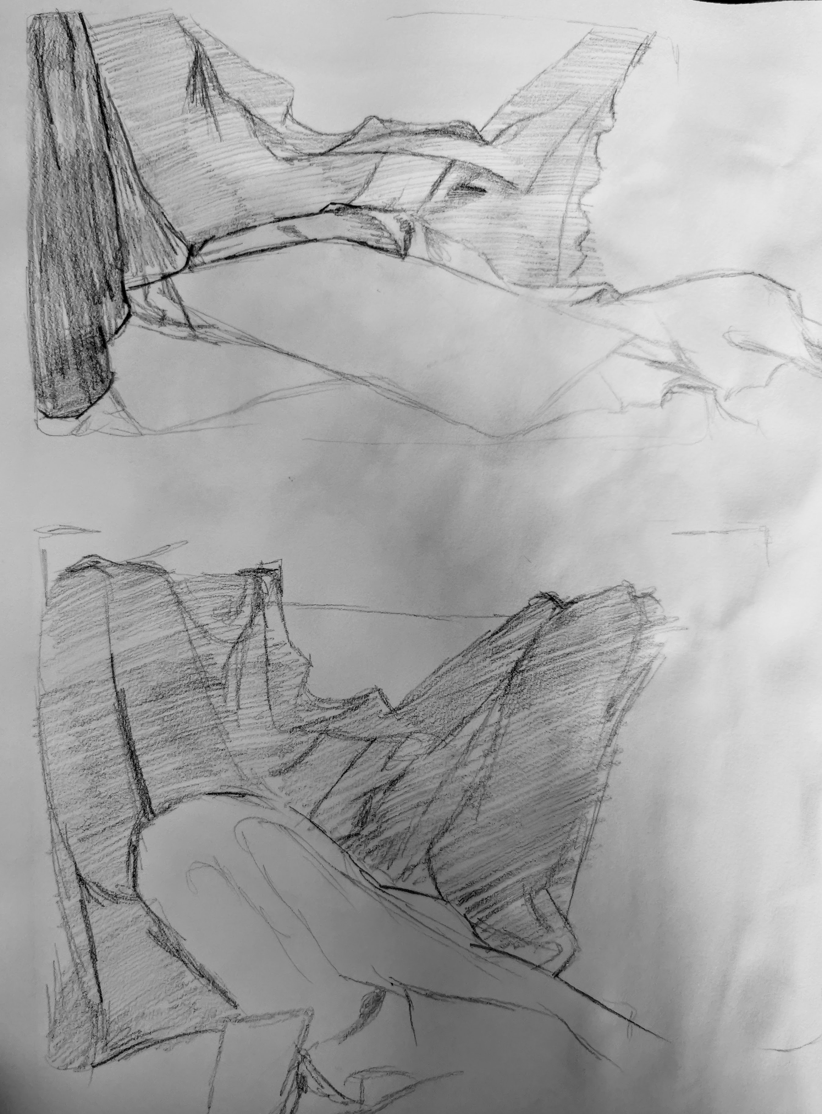
I kept the sketches rougher and focused on which one was more readable even without refinement which ended up being the second sketch which has less material variation allowing for more focus on the folds and shaping of material. The first sketch has more variation in tone but is harder to read as it didn't have a clear outline shape and it ended up looking more like a pile of washing than an intentional set up.
I also documented a few more variations through takeing pictures of the settings as seen below:


Reference image

Final piece.

This final piece ended up turning out pretty well but there are pros and cons . One thing that I think worked well was the shaping of the folds as I think I got them to look well shaped especially in the centre of the piece as the contrast pushed the depth more, giving it shape. I also was happy with the shape of the edge details of the blanket which turn into a fold, here I tried to alter the shape of the design of the edge to fit the flow of the fold and this was successful.
One improvement I would make would be to have more contrast in the linework of the piece as outside on the centre it is all quite light and adding some heavier areas could help represent the weight of the drapery more. Contrast could also be pushed in the material covering the rounded object as it would bring it more further forward in the scene and set it more concretely as the focal point, which currently it is not .
Another thing I think went well is the use of edge highlighting to make a fold look sharper in certain areas such as the centre and areas with a cluster of smaller prominent folds. I also used to create inert folds upon a material by putting down areas of tone and removing it through dabbing the putty rubber on it.
after feedback

No 2


No comments:
Post a Comment