


When setting up the still life I tried to find a mostly cylindrical objects with variety levels of complexity.
 The simplest was the nail polish bottle which can be broken down to two simple cylinders stacked. The inhaler was the most complicated since the shapes weren’t as straight forward and the spray can was the middle ground on the two.
Sketch

When sketching everything out I found the hardest part to be the inhaler as its structure was not as straight forward as things overlapped and some areas tapered off a little, such as the mouthpiece. I do think areas need improvement in this piece such as the nail polish bottle which doesn't look as rounded as in the still life set up, this may be because I made the box too wide so when making the perimeter of the circle it became more stretched out than I intended, also the perspective on the inhaler looks a bit off and if I were to go ack in and redo it I would try and double check my angles again to ensure its not inaccurate.
Tonal drawing

After finishing the initial sketch I added tonal shading gradually. I managed to correct some issues that popped up during the sketch phase whilst shading, such as the nail polish bottle which now looks more rounded and full as I made the circle at the top of the bottle more obvious so it could inform the structure of the rest of the object .
When shading the different object I tried to keep in mind the way the light played upon the surface of the object, for example on the metal spray can it had a few strips of lighter areas were the light from the window behind me was reflecting so I shaded around these areas to make them stand out. I think the shading on the inhaler was the most successful as I had more of a contrast between light and dark and the shading really helped to build up the shape of the inhaler more. The shading worked perticually well in the end closest where the metal canister is inside the plastic container as the contrast here showed the difference in materials and also pushed that sense of depth as the darkness increases further into the inside on the plastic container. I think that I should have paid more care into the reflectivity in the metal canister as its not clear that it is in fact a shiny metal as it looks quite dull as I didn't put enough light areas into it.
New drawing based on feedback


Reference image


Sheet 1
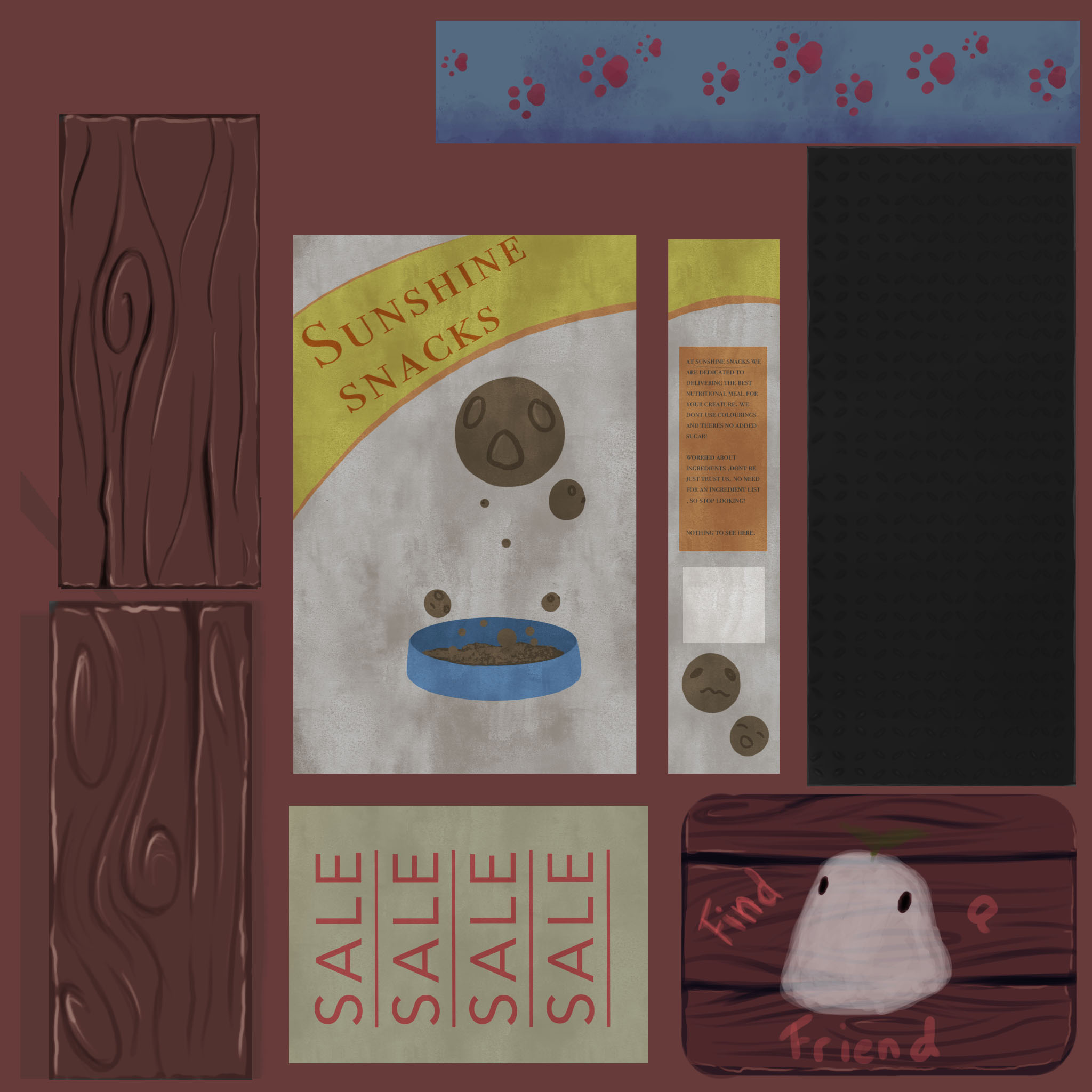
Shop sign
This was a must have for a shop, I wanted it to be hand painted and a bit childish looking so the shop came across as a more playful concept. I again just went with my go to wood texture for the main part of the sign and then overlaid a rougher painting for the contense of the sign and I think this worked pretty well.I think the shading in the cracks however can be too dark and it is a bit too dark especially went it is right up against the lighter colour painting on the sign.
Poster
I made a small sale poster to pop around the scene as a bit of scene filler, a way to make it look a bit more believable and fleshed out. I do think that adding a bit more damage such as slight rips on the corners or were the pin is would have improved it a bit more but since it is a simple prop there is a limit to what I could do to it without making it too busy.
Food box
As a main prop that really fleshed out the concept more I wanted it to be more colourful and grab attention. So I used yellows and oranges for the majority of the design which is much more saturated than the browns and cream surrounding it in the rest of the scene. I made it a bit plain so it could be reused for the different sides without it becoming really messy.
Bowl
Another key prop, I again aimed for more saturated colours when painting these in and I also wanted it to complement the colours in the food box so I chose blues and pinks, I decided to go with a simple paw print pattern which was a bit cartoony to match the way the packing of the food boxes looked so things would be more uniform. I also added some darker tones along the bottom so it will have more of a definitive shape when it is in the scene, I think to complement this I could have added a small amount of highlight at the top however.
Metal shelves
I painted a basic patterned metal, the sort you see on ladders and stairs, for a slightly more industrial look and it worked well. I also ended up using this for the frame of the shelves so it would match, so its quite versatile and can be used for multiple different things which is useful. I do think it could have benefited from a tad more detail in the painting however but overall I am happy with it.
Wooden planks
I wanted to have these so I could build a crate to put stuff in out front of the shop, I used the same wooden whirl pattern to keep things coherent and tried to avoid too much detail so it didn't become repetitive and overwhelming to look at. I made two different ones, one with darker colours than the other which could be used for the base of a crate and give it more depth .
Sheet 2

Bones
Since it was a pet shop I decided to make some bones to put in the crate and on the shelves but I didn’t want just one type so to avoid having to draw loads of different type I stuck to the stereotypical bone shape and used a few different colour versions so that there would be variety without the time consumption of multiple unique pieces. The colours were based of colours I have seen in dog chew bones that get for my dog and I think they matched the scene quite nicely in the end. I think the main improvement I would make would be adding more texture to them as they do look a bit flatter than I would have liked them too currently.
Delivery boxes
To add more to the realistic side of the narrative I decided to make some delivery boxes to put in the back to make it look like they just got some new stock or that they had put out the boxes from their recent order out for recycling. I kept the design simple as it wasn't a main feature but I did make sure to add some grime to the bases as they were on the floor and that tends to leave a mark on white boxes after a while. The addition of this really helped to make the scene more believable in the end I think.
Poster 2
I wanted to hide a story easter egg in the scene to build the story around this shop more so I added an emergency evacuation notice that would add to why everything was on sale as they wanted to get rid of the stock whilst hey could. I was quite happy with this as although it was a small piece I did like the addition of mud-flecks and slightly worn paper.
Chalkboard
I often see outdoor chalkboards in fount of shops which are drawn out by artists and advertise something within the shop. They remind me of small local shops which I what I want to emulate so I made my own. I used a pastel brush on Photoshop so the lettering and drawing had texture. I stuck to using three colours for the chalk, which were all lighter colours which helps it to stand out against the blackness of the chalkboard backing .
Stars
These were last minute additions to add more variation in height and shape of the products displayed and small star accessories seemed like a nice little addition to make since they are simple but bright and cheerful looking. I was aware these were going to be quite expensive in the tris count so I tried to not have a lot of detail that might be lost if I had to make them less expensive.
Overall comment on the trim sheets
I think the trim sheets turned out quite nicely but I do think I ended up wasting quite a bit of space, I didn't have anymore props I wanted to add so if I were to go back and do them again I would instead make the props bigger and allow them to be more detailed in the final product and not waste anymore space.

- normal beams
- a decorative beam
- A door
- Hindges
- A window
-A shopfrount window
- Metal sampling
Normal beams
With the standard beams I went with a fairly simple wood pattern that had swirls that flowed to make it look more interesting than just plain wood. I think I would make the shadows a bit lighter and have a more purple undertone but overall the use of gradient maps made it easy for me to add a range of tones that blended well and created a nice final product. Another improvement would be to have more edge highlighting to make them look a little less flat as it defines the shape a bit more.
Decorative beams
I added this decorative beam to provide an alternative for the edges of the structure, I added small glyph of the small creatures I designed on the bean, entangled by the swirling patters that traced across the wood. I think it would have been an improvement if I lessened the amount of detail so its not as busy but I am still pleased with the outcome and, used sparingly, this will make a good addition to my model.
Door & Hinges
This door is pretty straight forward, I kept the depths of the cracks shallower as to have a change of the deeper ones on the beams and offsetting this would create a better balance overall in the finished model, but I still made sure to have depth in the separation of the metal and as the edges get further away.
The hinges were also simple but I would argue that they are maybe just a bit too simple and that a few scuffs on the edges would have helped to add more texture and this would also make them look like they are older, matching the wear and tear on the rest of the build as these shouldn't look as new as they do.
Window
These were based of ones I saw when doing my research into the different types of half timber Tudor buildings. It seemed common to have darker metal grids and glass that wasn't clear to look through. I kept the metal lattice pattern very simple like the ones below and I tried to add some rusting around them as it made it look aged and rougher which is what I was going for, this worked well and had the added benefit of putting some depth under the metal areas to they looked more like they were sitting on top than painted on.But to improve I think I would lean more into making the windows look even more rusted and I would also make the orange a bit paler as light is never that orange and it looks more like a fire is roaring inside the house that a quaint light.

Shopfront window
This one was to add more narrative to the building, as I previously explained in the blog post about my research for this project , I wanted to use this window to show products and pets in the shop window like you would get in a normal shop. This is also way to add more of a story to a piece through subtle details that give hints to a viewer so they can weave the story together. I think to improve I would try and make all the muntins (glazing bar or sash bar is a strip of wood or metal separating and holding panes of glass in a window. ) an equal size and make the main framework clearer. but currently I do think its makes a nice addition to have the small creatures in the window looking out, I think to improve I'd also include more of a background to the window as it seems to be strange without one.
Metal sample
I wanted to use this for the various metal parts around the model such as the chimney and the bracket for the sign prop to hang off. I kept it pretty generic and tried to make it look like a rougher metal but not too damaged.
Further details

Before I start the shop front project I wanted to know what I was aiming. I looked into real half timber Tudor houses and saw there was quite a variety of builds. Some leaned more standardised and some looking more unstable in a way. For reference I focused on the buildings in the York shambles, a small street in York that has become known for its Tudor built shops which are normally packed with Harry potter fans as this is the street that Diagon ally was based off. I chose this place as its more authentic, most of the images I was finding of Tudor half timber houses and shops were well painted and had been kitted out for the 21st century person were as the shambles, well lets say the name is a good fit. Bar the pearly white windows the buildings are worn and all have a lean to them .


This task was a bit of a challenge for me as I have always struggled with using perspective grids for interiors so this really helped me to push my understanding of how to use them and I have now become more comfortable using them.
One point perspective


Id also go back in and push the shading a bit more to further improve the drawing as it does look a bit under developed overall since there less contrast than I would have liked it to end up.


Two point perspective


Reference images

the other two drawings were done before a furniture shift round unfortunately so images wouldn't be accurate and therefor have been exempt
Deciding on just one idea is always a challenge of mine, for this task I had a number of very ambitious ideas such as a shop that sold housekeepers that had been shrunk for your desk however I had to reign it in a little to fit with something achievable. So I limited myself to build three ideas and then chose one that sparked interest the most.
Idea 1- The seers eyes
This idea was the most macabre of the three, in this shop would be sol a collection of eyes taken from seers(people who can see the furture) . Some eyes would be single use were as more expensive ones would be multi use. The main assets for this idea would be jars and eyes. accompanied with plants and signboards for sales. Although this is seemed like a cool idea to me it didn't spark much excitement so I moved on to another idea.
Idea 2- Astrobargins
This one is pretty straightforward, a shop that sells all things star related , including the stars. This idea would have assets such as stars in bowls, moon lights and books scattered about with plants trailing the sides of the house giving it a more warm and storybook like atmosphere. Signage would be used a bit more for sales signs also.
Idea 3- Curious Creatures
This was my favourite of the three ideas simply because it has more variety. This shop is a pet shop but I wont be modelling complicated creatures,the only pets on show will be a made up fantasy creature of my own design.
 |
| blups sketch 1 |
For this pet store I have a wider range of assets to include such as
- boxes of food
- beds
- books on care
- pet toys
- bowls
and if I can figure out how to make glass I can put glass boxes on tables to as their 'cages'
I will also be adding some climbing plants onto the side of the building to make it look more cottage like and friendly as leaving it bare reminds me more of cramped little roads than the more open village shop that I'm going for.
What Now?
Going forward with idea three I will be creating a trim sheet and various tilling textures to get the base of the building down and then will make onto the smaller assets that will fit around it. I will be trying to fit the design of the building around the concept of the shop through smaller details so it all ties together nicely at the end.
For this task since I wasnt able to go in person due to self isolation I decided to chose a building I knew already from my hometown, I chose this building as it was intresting with layers of shapes to deal with and some patterns on the brickwork. The bulding itself has been around for over a hundred years and it has the more ornate architechture at was common at the time.

Initial cleaned sketch

Tonal shading and refinement

I then went on to slowly add shading based on the lighting in the reference. I was very happy with how the shading turned out , perceptually the shading on the banner on the entrance way as although its a small detail i managed to make it look like a material banner and not just a normal solid sign and materials aren't my strong point. I think looking back I slightly scewd the right side of the building and I think if i were to do it again Id spend a little longer making sure it was all inline before moving onto shading because it would be very hard to fix now. I think the drawing would also benefit from more development into the foliage in the background to better establish the building in a real world rather than just a drawing.
Another successful point was the shape of the wooden planks that make up the fence, I purposefully tried to make them more rough as it is very rare to have perfectly straight and boxed off wooden fences and since this fence is quite old the misshaped planks really helped to portray this and keep it more close to real life.
Improvements made based of feedback

(NOTES UNRELATED TO DRAWING EVALUATION)
I've added this as an extra as I think the buildings history is interesting as its survived two world wars and I found some old photos wanted to share some you to see.

In this post we will be looking into optimisation in games and why it is important
Pre-rendered vs Real time rendering
The most noticeable difference between these two is visual, pre-rendered scenes are much higher quality were as real time rendering lowers the quality.
The lower quality however is because your computer is rebuilding the scene around 60 times a second which takes a lot to process so simplifying the graphics makes it easier to process, this is most often used for games or other interactive media. this works with both 3d and 2d and a good example of a 2d game that uses real time rendering is Cup Head seen on the right and a 3d example is D.R.O.N.E seen on the left

In comparison pre-rendered material is higher quality but isn't interactive so is mainly used for films and TV. The rendering for the scenes can take hours for just a few minutes but are able to reach a level of detail and realism that can often make a viewer question whether what they are watching is real or not.
A good example of this is in the movie Interstellar, the black hole scene in the film was made by the biggest visual effects studio in the world and their status really showed in what they achieve. Working alongside scientist on their team they managed to create the most physically accurate images of a spinning black hole ever, however this took up to 100 hours of rendering per frame and totalled 800 terabytes of data, the outcome is astounding and beautiful but there is no chance this could have been done using real time rendering unless everyone had some kind of super computer from the future to hand. Until then scenes like this are limited to films .
 |
| Interstellar black hole https://blenderartists.org/uploads/default/original/4X/a/5/e/a5ee598b1d0794a71b52802e2cab389d8f90f7da.jpg |


The main thing I would improve about this drawing would be the length of some of the lines as some are shorter and longer than they should be which then throws off the perspective.An example of this would be the closest edge of the book has a shorter line than the edge on the right which doesn't make sense, making this line longer would solve this. To avoid this all together in the future I should properly measure the shapes and take a step back to re evaluate my drawing before I push forward with the shading
On the topic of the tonal shading I think I made a good start on the shading particularly in the book pages but it could be pushed further and developed to help properly inform the shapes. One thing I think I did pretty well was the use of line weight to focus attention in the drawing, for example the lines on the book and corners of the tardis model are darker and a bit thicker than the ones in the two boxes which have increasingly subtle lines as the shape gets further away.

Based on feedback I went back into this piece and lengthed the closest edge of the book to make the perspective more accurate, smaller changes to line angles were also made for the same reason which resulted in a more accurate final outcome.
I also further developed the shading which fleshed out the shapes a bit more and gave a better impression of the lighting in the scene..
SECOND STILL LIFE

In this drawing I tried to learn from my mistakes in the first drawing. I payed more attention to the lengths of the lines and how the are effecting the accuracy of the perspective and this lead to the outcome looking more accurate, although it can still be improved as the cylinders furthest face could have been made smaller as currently it does look a tad bit off . I think I did well on the shading and was able to properly show depth and how the light played upon the surface of the objects in the scene for example the corner between the boxes and the book has a gradual shading to help make the corner look more further back in the scene and extenuate the shape.

To improve this piece Id make adjustments to a few lines to the perspective clearer, such as the closest edge of the book and the furthest face of the cylinder. Id also put a little more contrast into the shading because I think that would push the shading that little bit further.
after recieving feedback I went back in and made some improvements which include the ones previously mentioned.


