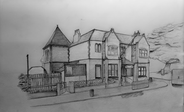
For this task since I wasnt able to go in person due to self isolation I decided to chose a building I knew already from my hometown, I chose this building as it was intresting with layers of shapes to deal with and some patterns on the brickwork. The bulding itself has been around for over a hundred years and it has the more ornate architechture at was common at the time.
Initial cleaned sketch
For the initial stages of the drawing I used my pencil to measure out the main chunks of the building, starting with simple shapes and moving into details as I go. This stage was all about making sure everything was proportioned right and using perspective grids to keep everything in line. I found that some of the lines were not properly vertical and this needed to be adjusted especially on the line closest to the viewpoint as it acts as an anchor point for the rest of the pieceTonal shading and refinement
I then went on to slowly add shading based on the lighting in the reference. I was very happy with how the shading turned out , perceptually the shading on the banner on the entrance way as although its a small detail i managed to make it look like a material banner and not just a normal solid sign and materials aren't my strong point. I think looking back I slightly scewd the right side of the building and I think if i were to do it again Id spend a little longer making sure it was all inline before moving onto shading because it would be very hard to fix now. I think the drawing would also benefit from more development into the foliage in the background to better establish the building in a real world rather than just a drawing.
Another successful point was the shape of the wooden planks that make up the fence, I purposefully tried to make them more rough as it is very rare to have perfectly straight and boxed off wooden fences and since this fence is quite old the misshaped planks really helped to portray this and keep it more close to real life.
Improvements made based of feedback
(NOTES UNRELATED TO DRAWING EVALUATION)
I've added this as an extra as I think the buildings history is interesting as its survived two world wars and I found some old photos wanted to share some you to see.


No comments:
Post a Comment