Sheet 1
Shop sign
This was a must have for a shop, I wanted it to be hand painted and a bit childish looking so the shop came across as a more playful concept. I again just went with my go to wood texture for the main part of the sign and then overlaid a rougher painting for the contense of the sign and I think this worked pretty well.I think the shading in the cracks however can be too dark and it is a bit too dark especially went it is right up against the lighter colour painting on the sign.
Poster
I made a small sale poster to pop around the scene as a bit of scene filler, a way to make it look a bit more believable and fleshed out. I do think that adding a bit more damage such as slight rips on the corners or were the pin is would have improved it a bit more but since it is a simple prop there is a limit to what I could do to it without making it too busy.
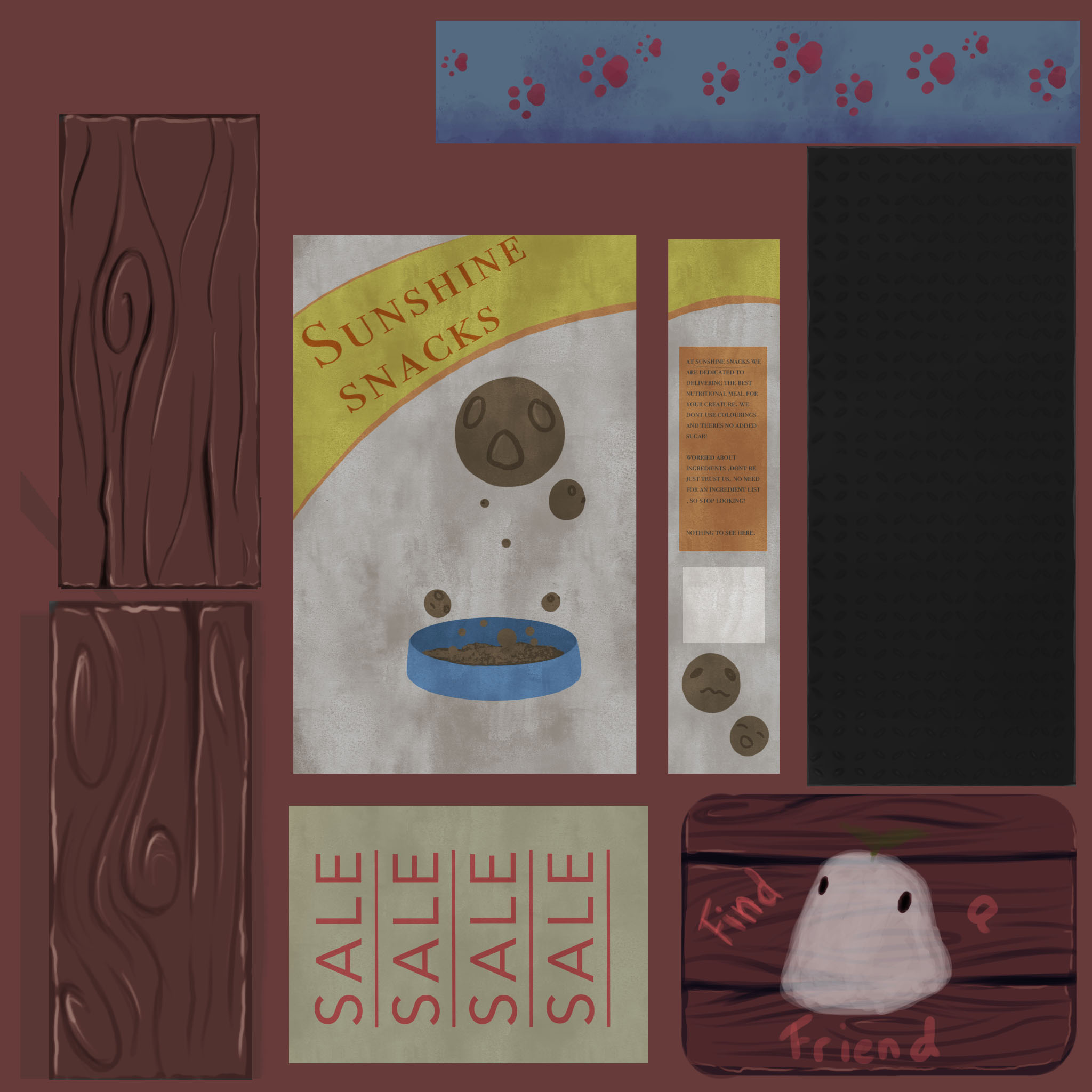
Food box
As a main prop that really fleshed out the concept more I wanted it to be more colourful and grab attention. So I used yellows and oranges for the majority of the design which is much more saturated than the browns and cream surrounding it in the rest of the scene. I made it a bit plain so it could be reused for the different sides without it becoming really messy.
Bowl
Another key prop, I again aimed for more saturated colours when painting these in and I also wanted it to complement the colours in the food box so I chose blues and pinks, I decided to go with a simple paw print pattern which was a bit cartoony to match the way the packing of the food boxes looked so things would be more uniform. I also added some darker tones along the bottom so it will have more of a definitive shape when it is in the scene, I think to complement this I could have added a small amount of highlight at the top however.
Metal shelves
I painted a basic patterned metal, the sort you see on ladders and stairs, for a slightly more industrial look and it worked well. I also ended up using this for the frame of the shelves so it would match, so its quite versatile and can be used for multiple different things which is useful. I do think it could have benefited from a tad more detail in the painting however but overall I am happy with it.
Wooden planks
I wanted to have these so I could build a crate to put stuff in out front of the shop, I used the same wooden whirl pattern to keep things coherent and tried to avoid too much detail so it didn't become repetitive and overwhelming to look at. I made two different ones, one with darker colours than the other which could be used for the base of a crate and give it more depth .
Sheet 2

Bones
Since it was a pet shop I decided to make some bones to put in the crate and on the shelves but I didn’t want just one type so to avoid having to draw loads of different type I stuck to the stereotypical bone shape and used a few different colour versions so that there would be variety without the time consumption of multiple unique pieces. The colours were based of colours I have seen in dog chew bones that get for my dog and I think they matched the scene quite nicely in the end. I think the main improvement I would make would be adding more texture to them as they do look a bit flatter than I would have liked them too currently.
Delivery boxes
To add more to the realistic side of the narrative I decided to make some delivery boxes to put in the back to make it look like they just got some new stock or that they had put out the boxes from their recent order out for recycling. I kept the design simple as it wasn't a main feature but I did make sure to add some grime to the bases as they were on the floor and that tends to leave a mark on white boxes after a while. The addition of this really helped to make the scene more believable in the end I think.
Poster 2
I wanted to hide a story easter egg in the scene to build the story around this shop more so I added an emergency evacuation notice that would add to why everything was on sale as they wanted to get rid of the stock whilst hey could. I was quite happy with this as although it was a small piece I did like the addition of mud-flecks and slightly worn paper.
Chalkboard
I often see outdoor chalkboards in fount of shops which are drawn out by artists and advertise something within the shop. They remind me of small local shops which I what I want to emulate so I made my own. I used a pastel brush on Photoshop so the lettering and drawing had texture. I stuck to using three colours for the chalk, which were all lighter colours which helps it to stand out against the blackness of the chalkboard backing .
Stars
These were last minute additions to add more variation in height and shape of the products displayed and small star accessories seemed like a nice little addition to make since they are simple but bright and cheerful looking. I was aware these were going to be quite expensive in the tris count so I tried to not have a lot of detail that might be lost if I had to make them less expensive.
Overall comment on the trim sheets
I think the trim sheets turned out quite nicely but I do think I ended up wasting quite a bit of space, I didn't have anymore props I wanted to add so if I were to go back and do them again I would instead make the props bigger and allow them to be more detailed in the final product and not waste anymore space.


No comments:
Post a Comment