Thursday, March 25, 2021

3 point perspective idea and sketch out

Idea generation

I had a few ideas for this piece such as a elderly persons sitting room or a spacecraft bedroom but I settled on a fantasy royal court setting as I wanted to have more fun with it and I enjoy making small funny creatures in grand environments since its absurd. To flesh the idea out more I threw together a mood board but I did find it hard to find specifics of what I wanted so it is defiantly a more general collection of items to be played and smush together in the sketching stage.


Cloak

I wanted to have some kind of clothing in the inventory so I decided to try and paint a long cloak, the main challenge with this piece was the folds in the material but I managed to paint these accuratly using fold reference and consulting tutorials on painting folds on the internet.


I painted this tonal first and then added a gradient map over top, I originally used a near black gradient map but I found it was as interesting as I wanted it to be so I experimented by adding layers of colour over top using blending modes which allowed me to build up colour and test out different options. I found that a mix of a maroon and blue layer created this really nice effect of the colours going from cool toned to warm as the colour gets darker.
 my favourate part of this piece is the gold trim of the cloak as I think that the range in value to match the folds worked really nicely here and brought a nice accent to the piece overall, it also broke up large blocks of colour so the piece didnt blend together .

the part that I think could have been better was the way the material hangs at the botton as I think this made the cloak look uneven in the end, to resolve this I would take my own reference photos using a light blanket to see how the material would look at the base in real life and study from that.


review 

to make the cloak fit in the inventory screen more so lighting was consistent I added a pink back lighting to the piece .


Sunday, March 21, 2021

Week 23

 Landscape hunting


To choose what to draw I went on a walk to look for nice landscapes in my area, i wasnt able to do the piece onsite as it would get very busy in that area later on . I wanted to try a natural setting since I need to work on my foliage painting and drawing and this is a good chance to do that. I also wanted to have some animals in the scene such as ducks and birds.


Sketching 

  I sketched out a few of the images to further cement which one I wanted to use ,  after choosing which one I wanted I sketched it out onto a A3 page, i had to make sure the sketch lines were light and easy to erase since i would be erasing the majority so they won't show through the colours. I think the base sketch was good but I should have put more attention on the layers of foliage at the back to get a better idea of how it was structured as I ended up struggling with this later on, also I think that the perspective of the path was a but off which made it look steeper than it achually was so next time I should look again at the angles within the scene to properly measure them in relation to whats around it. I think I managed to get the shape of the lake well represented through minimal detail in the sketch which meant I had a solid base to go on whilst painting .


Final piece


Since I was using watercolours my main focus was getting good areas of colour to build upon with details and highlights. For example for the lake I started out with washes of colour to match the algae brown colour of the lake, to find the main colour I found blurring your eyes takes away detail and leaves slodges of main colour. Then I went over top with a variety of colours and smaller brushes to make the ripples in the lake, I found it quite hard to get this right because it always seemed to balance between water and long grass but I tried to fix this using more rounded shapes at the end since ripples are radiating ovals rather than flicks, this is a mistake I made early on and next time I will try and pay closer attention to the shapes of textures and reflections. Another thing i think could have been improved is the colouring of the path right its more saturated than the path in the reference . One successful part of the piece was the painting of the orange bush in the back which has a nice depth throughout because of the harsh shadows that frame the shape of the bush.


Revisoon

Week 24

 Landscape hunting


I chose to go for the more gothic side of medieval architecture, there is a church in my local area from the mid 1500s which I chose to use as my subject


Sketching 

  Based on images from images that I had of the building and others from the internet I created thumbnail sketches to decide which one I liked best, each had their own charm but I chose the one highlighted since it had a nice balance of levels within the scene . I couldn't decide whether I wanted to do the piece in colour or in black materials, so to test I did very rough tests to decide which one I preferred. I found the tonal piece looked much more gothic and grimm than I wanted it to be so I decided that I'd do the piece in colour using a mix of watercolour and pencils .


Final piece


The final piece for this week is a fairytale like which I personally really like because it contrasts the personal association I have with churches like this which is this image of death and rules, whereas as here it feels new and light. I think my main improvement I would suggest for this piece is to refine details and have clearer lines and edges as I think it is missing an element of structure, for example the top of the main building has some small details that on the right are fairly well done but on the left are abstract and unclear, I could have gone in with pencil to fix this in hindsight which I must keep in mind for next time. Another thing Id fix is the larger shadow on the right side of the building, I struggled finding the right hue to use and I think building it up gradually to get the tone right would have been a better approach since it isn't working well here, it would also give more of a chance to build in more detail as the shadow is developed so the area looks less bland. One thing I think went well was the painting of the moss as I struggled at first to figure out how to apply it without making it look like climbing plants as moss looks a bit like chalk paint on a building at a distance. So I found taking a small amount on a dry brush and dabbing it on top of the base colours created this effect well, I also try to replicate the face the bricks effect breaks and shape of moss on the building which you can see most on the area closest to the viewer. Overall I am happy with the outcome but I think I need to practice more with refining my use of shadow all around in colour since I can find it challenging and it is seen here through both the refining and large shadow hue issues mentioned earlier.


Revision 1:


Thursday, March 11, 2021

Notan method

 When drawing these notans i found it fun to challenge myself to come up with a variety of ideas, i also found the process similar to the line and shading process of manga. Based on this i ended up referencing how they show shadow and light in manga pages which was very useful, such references can be seen below


Set 1 -base


Iterations 


I found it hard with this base to have a large variety of ideas but there are some interesting scenes here, my favourite being the last one as it feels like the entrance to a boss battle and the juxtaposition of the boats being made to look minuscule compared to the rock provides some nice visual intrests. The least interesting piece was the second since although the scene is nice and dramatic, the perspective does work well and flattens things .

Set2 -base


Iterations 


This set was my favourite as it had much more variation, I especially liked the mushroom cloud piece as the shapes within the cloud are really interesting and push that billowing shapes further.the least successful   idea was the first one with the little shop as I think the composition isn’t great and it just looks a bit dull compared to the others.

1 point and 2 point perspective

 One point perspective


Reference was of the rocinante from the Tv show the expanse

This piece worked really nicely in one point and I like the tonal sketch but I do think pushing it further would be super interesting to see. One improvement would be the roof area as some parts do look a bit off.

Two point 

Chicken temple based in the sky that hold the grand golden egg on top . 


I was very happy with this piece, I developed this sketch more and the to al contrast provides a very dramatic atmosphere which is Ironic for the subject. One improvement I would suggest would be to look again at the direction of the bricks on the right as the seem to be angled a bit too far upward, further defining the leaves would also be a great idea.my favourite part of this piece is the definition of the metal spikes at the top as they are very readably shiny and this contrasts the rough texture of the brick below.

Sunday, March 7, 2021

National portrait gallery

 National portrait gallery observation


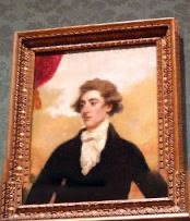
The pieces I liked the best from the virtual tour of the National Portrait gallery was the two pictured below, I unfortunately couldn't see the name of the pieces or the artist . The way the skin is painted, the pink hue makes them look flushed and healthy, it also has a good representation of the layers underneath.


Sketches


{needupdate}


I picked two references and did a colour study of each using pencils. My main aim was to try different ways of getting that depth in the skin and the tones. The first I layed down a base skin tone first and then went back out with the colours, the pecil i used for the base colour was slightly more way than the others so I did find that there was a limit to how much could be layered and blended overtop. The secon I layed down areas of colour around the face and added a small amount of light shading and then applied the skin colour overtop which also blended the colours already down into a smoother gradient due to the waxy pencil being used. I found that this worked better and was easier to work with as well so I used this in the final piece. I prefered the silhouette of the first subject however and I haven't done a side profile as of yet so I decided to use that subject reference.


Final piece. 


The main improvement I would make to this piece would be to work more into the colours and add more blues and purples in areas of shadow as its a bit unbalanced now. I would also look again at the colours on the lips and attempt to use cooler colours as it's more of a deep red than a pinkish red in the reference. One thing I think went well was the shaping around the nose as the cool tones give a good impression of shadow which is contrasted by the pink around the edges of the nose.


Overall I am happy with this piece and although I do find working in coloured pencil a challenge I found a way to use them that suited me well.

After feedback


Second revision 
Blue around orbit of chin


References used for portraits