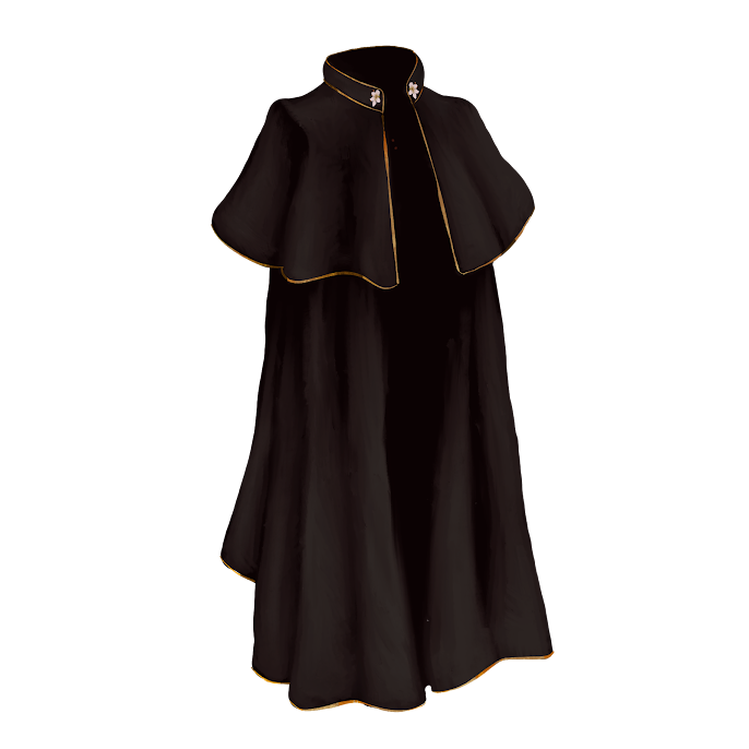
I wanted to have some kind of clothing in the inventory so I decided to try and paint a long cloak, the main challenge with this piece was the folds in the material but I managed to paint these accuratly using fold reference and consulting tutorials on painting folds on the internet.
I painted this tonal first and then added a gradient map over top, I originally used a near black gradient map but I found it was as interesting as I wanted it to be so I experimented by adding layers of colour over top using blending modes which allowed me to build up colour and test out different options. I found that a mix of a maroon and blue layer created this really nice effect of the colours going from cool toned to warm as the colour gets darker.
my favourate part of this piece is the gold trim of the cloak as I think that the range in value to match the folds worked really nicely here and brought a nice accent to the piece overall, it also broke up large blocks of colour so the piece didnt blend together .
the part that I think could have been better was the way the material hangs at the botton as I think this made the cloak look uneven in the end, to resolve this I would take my own reference photos using a light blanket to see how the material would look at the base in real life and study from that.
to make the cloak fit in the inventory screen more so lighting was consistent I added a pink back lighting to the piece .


No comments:
Post a Comment