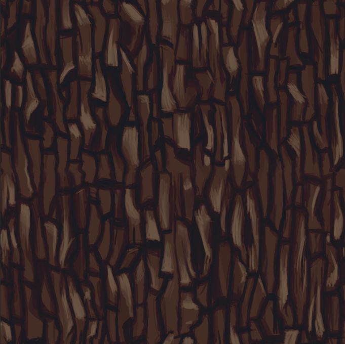
Tiling texture
The first thing I did for this task was research images of bark so I had a reference to go off instead of working from imagination which would increase the chance of inaccuracy.

I noticed that the bark sometimes overlaps and the shapes are all asymmetric and rough. within each segment there is often breaks and cracks often were the bends in the shapes are.

I've also noticed that the width of the cervices vary from tree to tree so I can change this as I want. The rougher texture could be built up through using more rough paint strokes and less smooth blending which would create harsher edges.
Initial sketch

I think I did make some segments a little too small which ended up making parts of the texture look a bit busy and if I were to redo it I would make them bigger so the texture flows better in the end.
Shading

I also added some random bits of darkness generally to quickly create a variation of levels within a currently flat piece without having to think too much .

Here I returned that background back to what I was ad changed it so allow you to see the sketch a bit clearer. Here I went back in adding some cracks here and there and throwing in some highlights which really helped to push that feeling of depth further and making it more readable.

I particularly wanted to put highlights on the edge of cracks to add some contrast and extenuate the depth of the cracks a bit more.
Colour gradient


Painting the branch was a simple task as I roughly sketched out a branch silhouette and then filled it in with some shading and threw a gradient map over top.
 these leaves were based off red bud leaves which have a cordate shape, I built up the tones in grey scale at first so I could focus on the contrast rather than fretting bout colour theory. I added colour later using gradient maps and I tried out a few different options
To finish I added a gradient map on top to add colour across the tonal painting. I had to mess with the sliders to get it to match the shading and have it it blend smoothly from one colour to another.
Overall I am happy with the outcome however I do think I should have and a bit more blending on the highlights as its a bit too rough for my liking right now.
Alpha textures

Painting the branch was a simple task as I roughly sketched out a branch silhouette and then filled it in with some shading and threw a gradient map over top.
image

I think I could still improve however, the contrast on the leaves could be exaggerated more to give abetter sense of depth within each leaf.putting more work into the creases of the leaf would also help refine the shape and details of the leaf further.

After painting the leaves I then when onto arranging the leaves and putting them onto the branch, I used various sizes to try and give the illusion of some leaves being on branches further back so the final product is more realistic. I also made them a bit darker which again helped to give it that more layered effect.


No comments:
Post a Comment